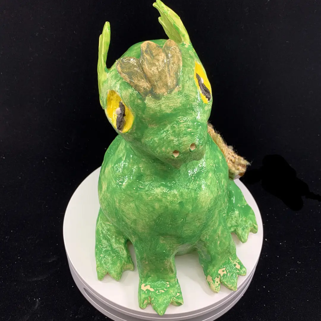
Brylee Howlett, Tree Hopper, 2022, glazed ceramic. (VCE Art and Design Student, Highview College, Maryborough Victoria.)
Congratulations to VCE Art and Design students from Maryborough Education Centre and Highview College for the amazing exhibition they have produced this year.
The quality of work presented is professional, thought-provoking, immersive and impressive.
While the Gallery is closed for its exciting redevelopment, this online exhibition celebrates and profiles the creativity of VCE art students from the region. What a bright future they have.
Congratulations also goes to our local art teachers from Maryborough Education Centre and Highview College for helping pull this exhibition together and guiding their students through their studies.
Mayor Cr Chris Meddows-Taylor
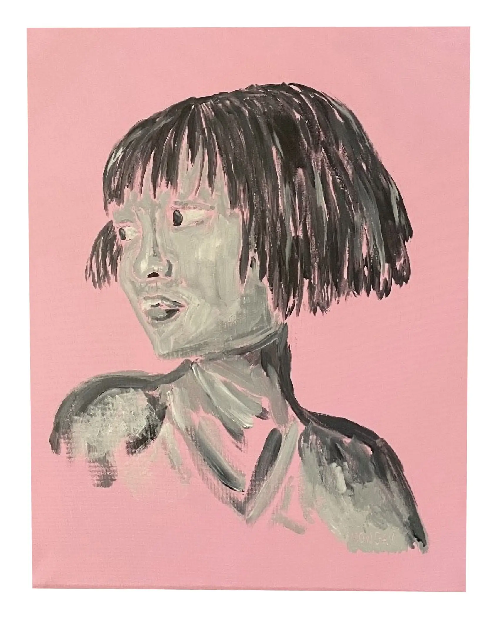
This painting is inspired by all the portraiture work seen throughout history. I used this idea as a lasting legacy to help reconnect with older times. It was inspired by all the different techniques and mediums used throughout history to create portraits and all their different meanings. The use of black and white paint symbolises old portraiture that used only a certain set of tones as well as to help connect with old times as black and white is usually associated with it. I used the pink to help accentuate the portrait more and to help catch the eye of viewers.
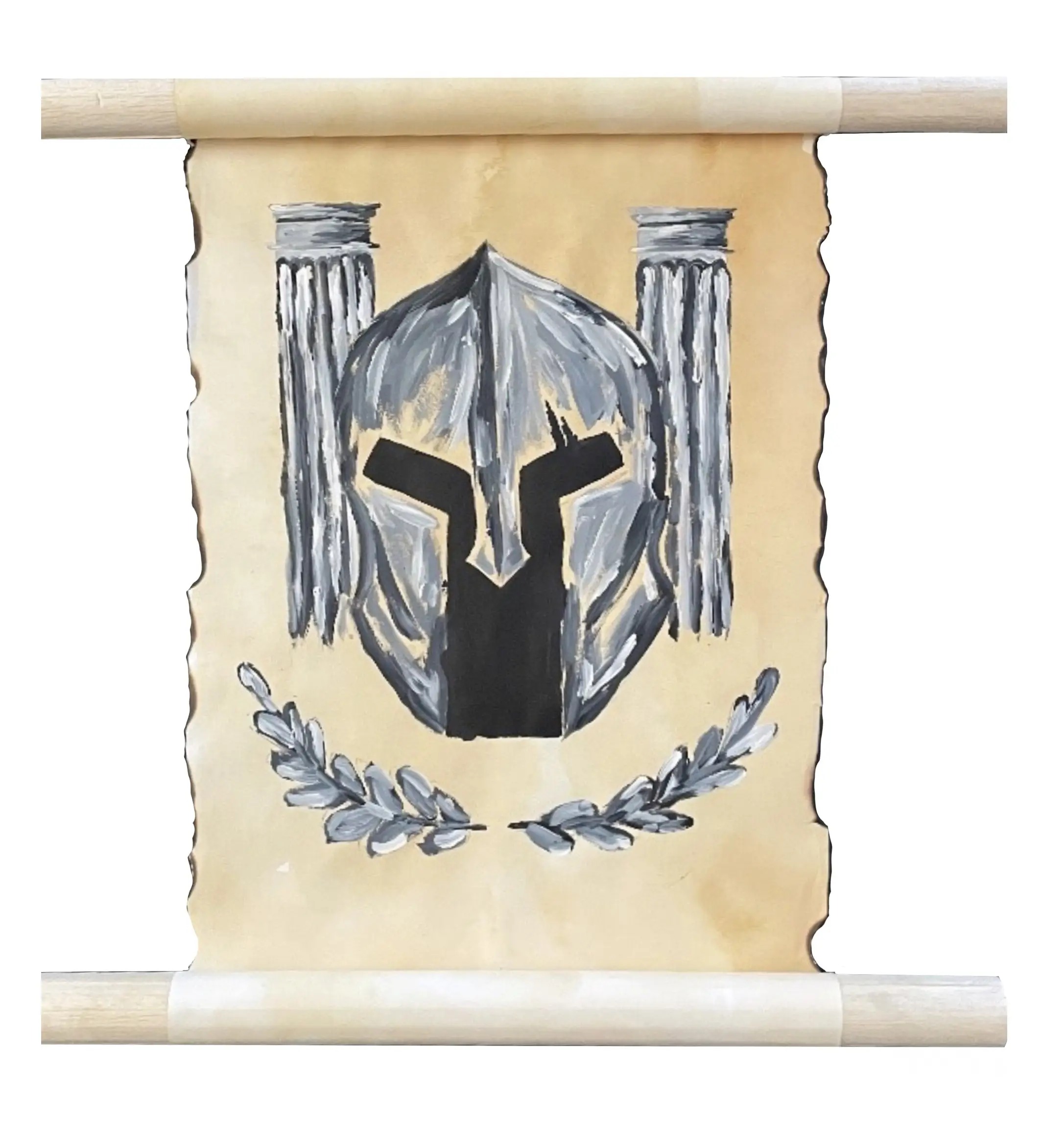
The initial inspiration for this art piece stemmed from my love of Ancient History and the beauty that is found within the ancient society of Greece. The painting represents the charisma and bravery of Sparta’s warriors which is symbolic through the helmet. The pillars in the background help solidify this idea as well as the popular laurel leaves. I began my process by testing different mediums to see which would work best for my final (artwork) and its desired qualities. I used tea to stain the paper to give it the old rustic look as well as present it in a scroll format to represent the symbolism of ancient times.
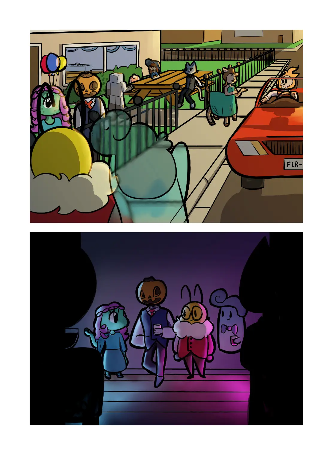
My inspiration for Party Start came from realising school was almost over and wanted to celebrate an end to this part of my life and to have something to look back on for the coming years post-graduation. Reflecting the idea of celebration through a party or formal of some kind allowed the use of balloons and colourful lighting to drive the idea of celebration. I began my process with creating different scenes to find one that reflected the idea the best which I went with a one-point perspective of a street and a silhouette border. Having a one-point perspective allowed more character varieties to be used to add creative flair while the silhouette gave a sense of space and focus on the main four characters.
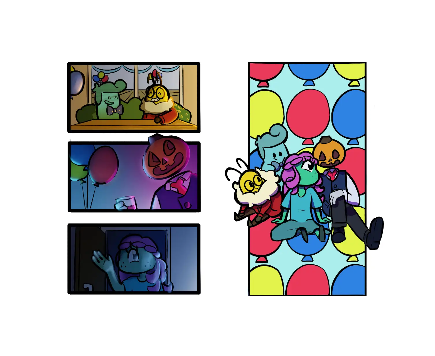
My inspiration for Party End was realising that I was finishing school and I wished to celebrate the end of this part of my life meanwhile having something to look back on. To symbolise the idea of celebration it was going to be shown through a party or formal which allowed me to use balloons and colourful lighting. I started developing my process through sketching a variety of scenes to find the angle and idea I wanted to follow. I went with the idea of using three panels depicting each moment of the celebration and one where four characters are sitting together with a patterned background. These ideas were focused specifically on the moment and the emotions of the characters as to represent the end and a new beginning to this part of life reflecting me finishing school.
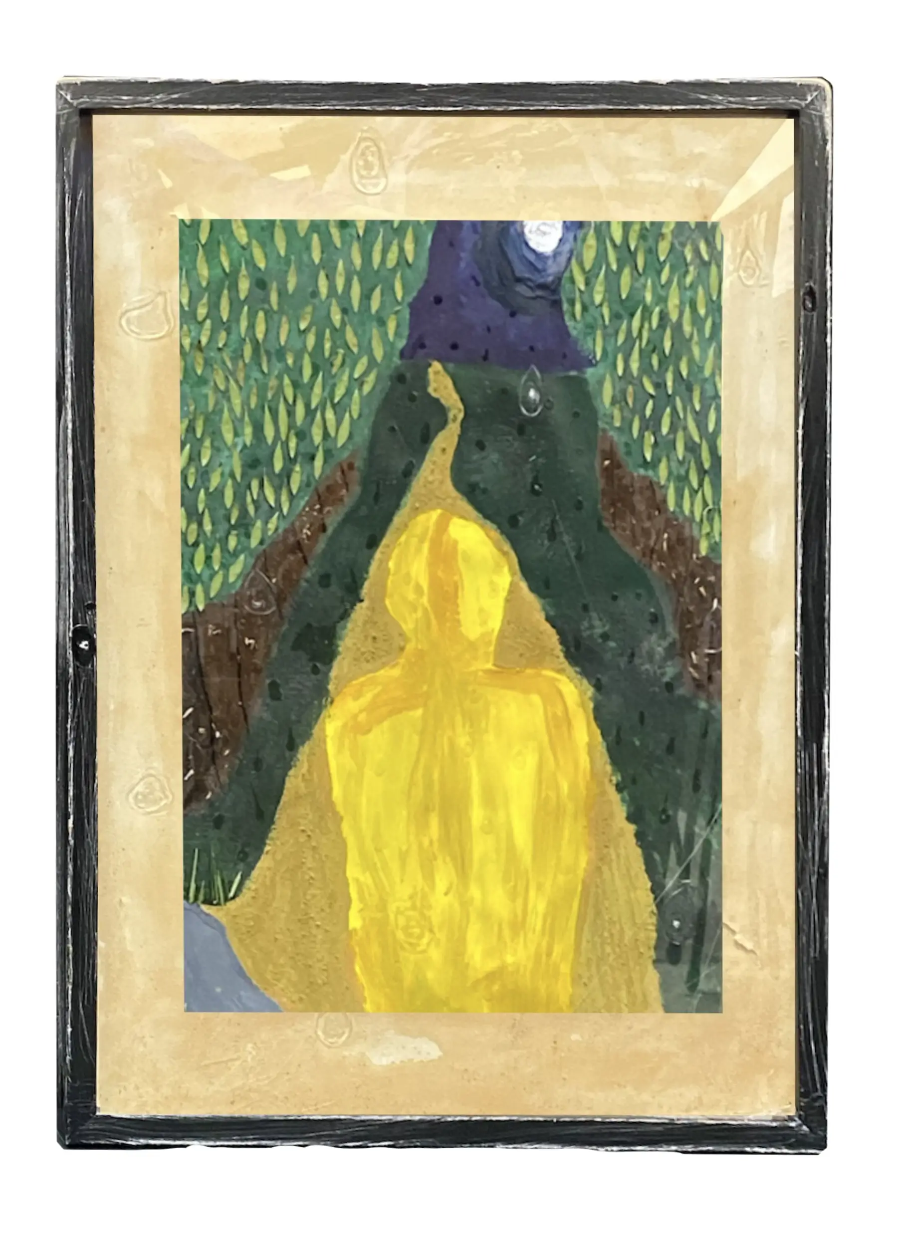
My inspiration for this piece came from my love of dark tropes within media. I took inspiration from directors such as Henry Selick and Tim Burton when it came to the colour palette that I used. For this piece I decided to not just stop at the actual painting itself, but also include the border and frame as well. I embedded elements from nature in this piece by a mixture of glueing them and mixing them into the paint such as: sand, grass, leaves and wood chips to give my art texture. I added glue to the paint to give the sky and moon added texture and create a homage shot of Henry Selick's; Coraline. For the border I darkened it with teabags and tore it slightly. The frame itself has been sanded back and decorated with clear glue to give the raining effect not only in the painting but also outside of it. I have also scratched the glass of the frame itself with a craft knife.
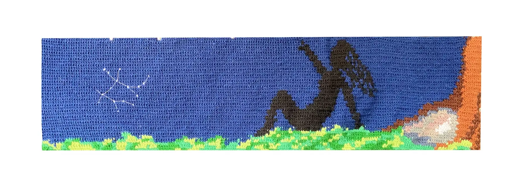
My inspiration for this piece came from my hobby of crochet. I decided to create a vast crochet landscape as it can be done on a large scale.
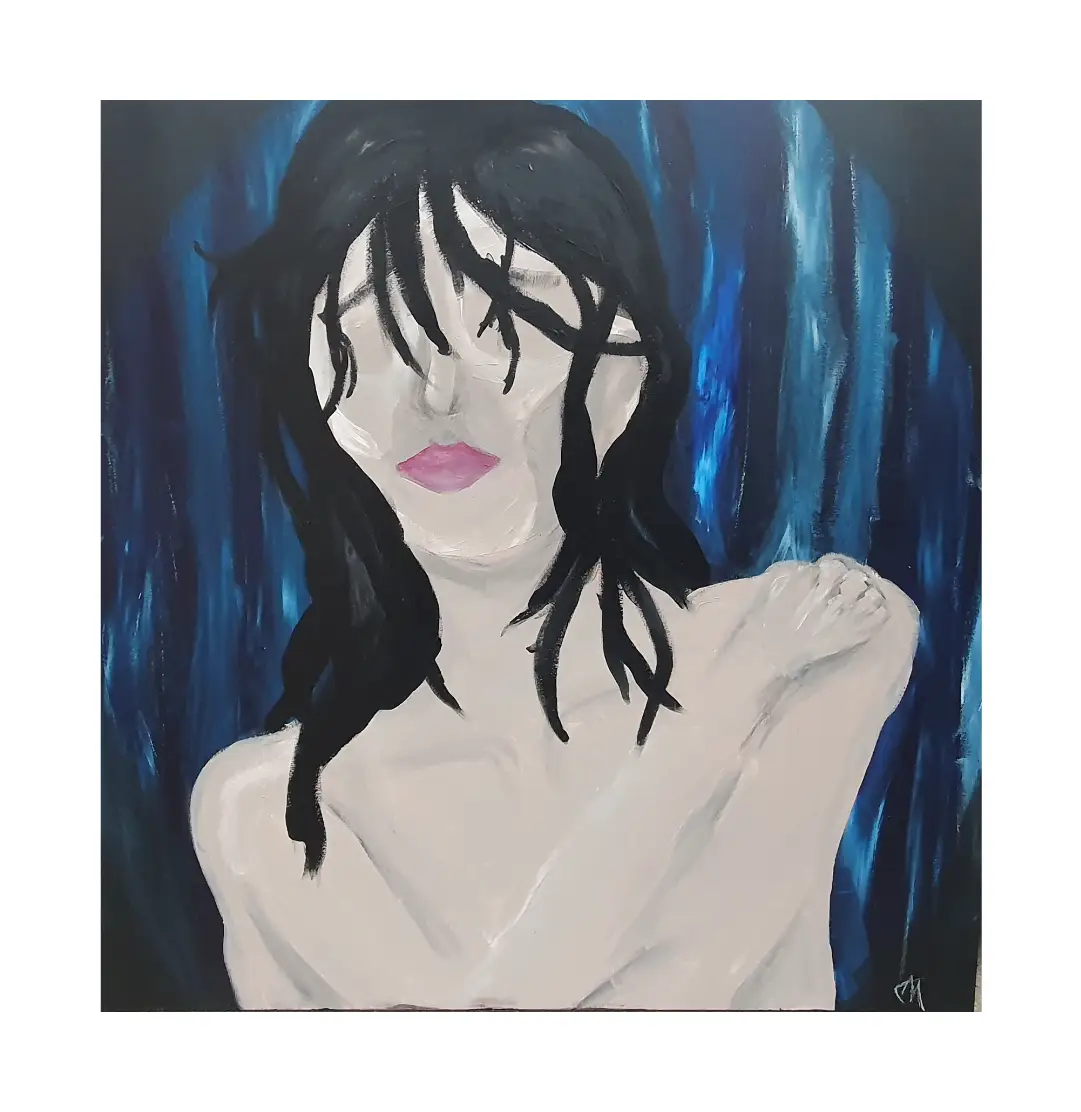
The artist created this piece with the intention of revealing the vulnerability and shame of live performance. The figure is portrayed naked to represent how a performer must expose their whole self while acting, exposing both their body and mind to a faceless audience. The figure is portrayed with traditionally feminine features and an ambiguous body to express the artist's thoughts on gender identity.
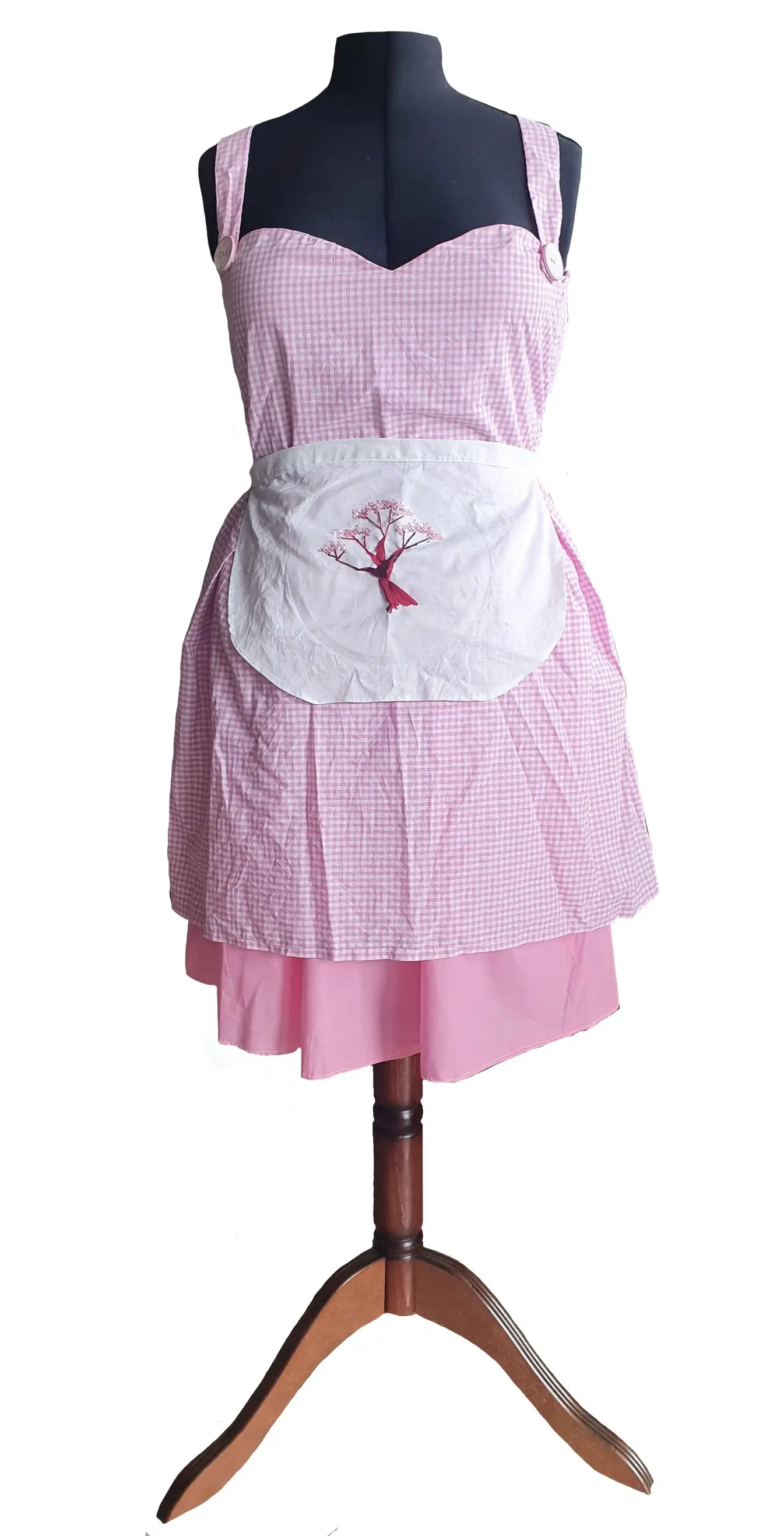
The artist's initial inspiration for Sakura stemmed from my passion for cosplay and fashion design. The garment is symbolic of a fictional character, while providing enough ambiguity to be perceived as a unique design. The blend of internet culture and traditional mediums such as dressmaking creates a modern adaptation of a timeless artform, birthing a new style of fashion. The textural difference within the fabrics the artist selected create a layer of tactile detail, with primarily soft fabrics to avoid the abrasive sensation of sensory difficulties regarding fabric types.
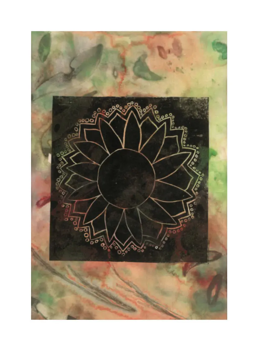
My initial inspiration for ‘Growth’ stemmed from my love of nature and my recent research into how many people are not connected to it as much as I am, and I wanted to express my love of nature of how beautiful it can be and re-connect an audience to nature again. The print itself that has been printed as the background represents an element of nature itself as I have used leaves to make the print with the organic nature of water colour on top to make it connective. I began my process by practicing different techniques as to how I was going to print a naturistic look behind the printmaking and what colour palette I was aiming for. I decided to go with a bright earthy hued background with a dark print that would contrast with the print. The print of the flower symbolizes growth and a connection to the audience.
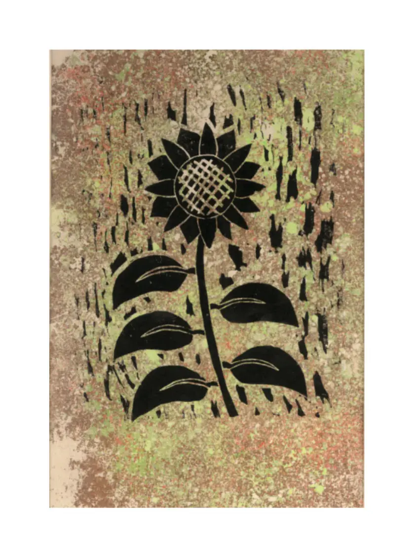
My initial inspiration for ‘Sunshine in the rain’ stemmed from my love of nature and my recent research into how many people are not connected to it as much as I am, and I wanted to express my love of nature of how beautiful it can be and re-connect an audience to nature again. The print itself that has been printed as the background represents an element of nature itself as I have used an earthy hued palette to make the print organic and earthy like. I began my process by practicing different techniques as to how I was going to print a naturistic look behind the printmaking. Then I decided to go with a chalk pastel chalky look of the ground. Using this medium allowed me to give an interactive texture that connected my audience to nature. The print of the flower symbolizes a large sunflower growing in the rain coming from the background as it plays a role of soul and grass.
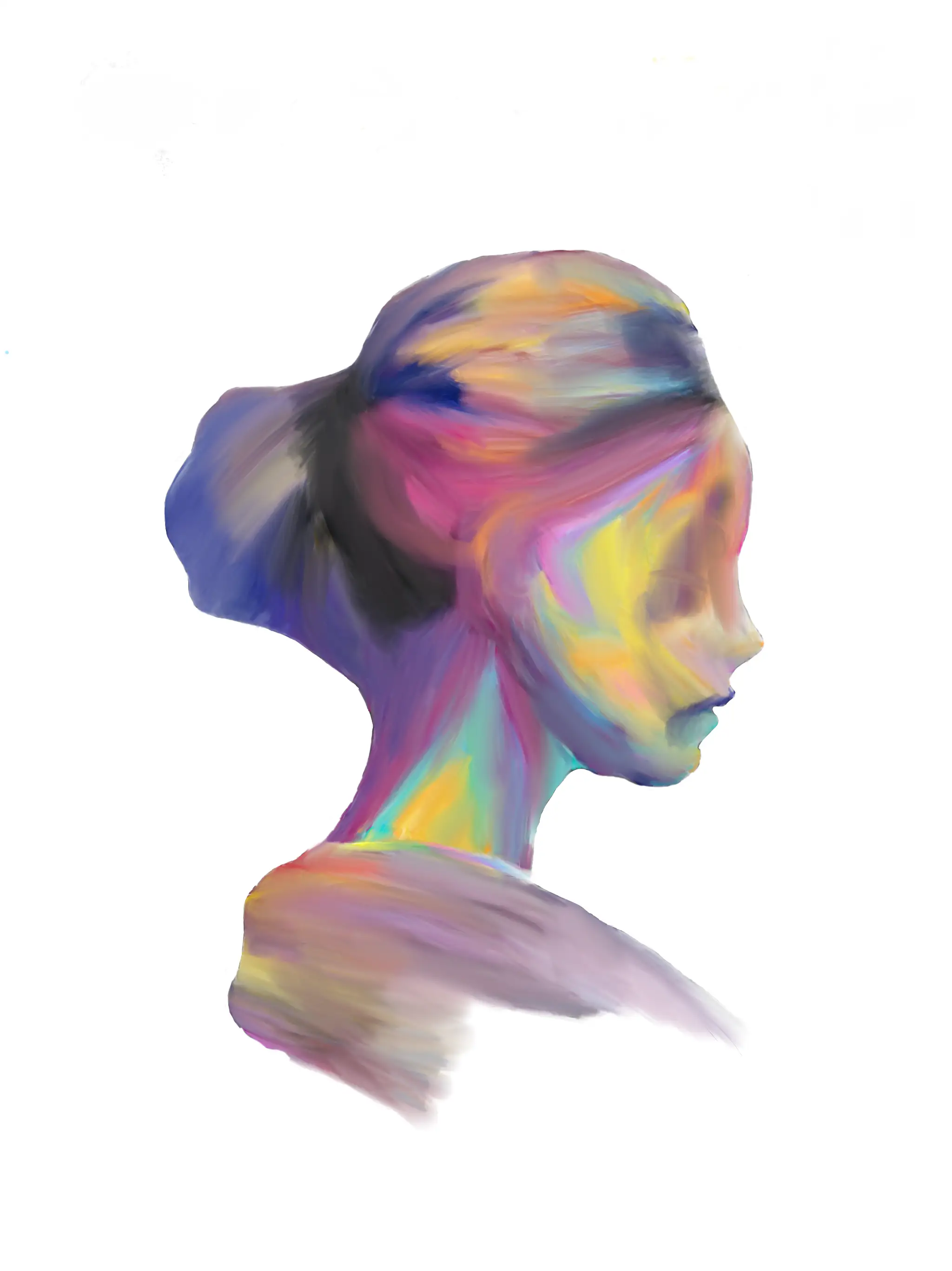
My primary inspiration for Eternal Feeling was from my determination to express emotions through the work of art and colour in this case digital art. This art is emblematic of a bigger picture of life that is run by our emotions and how they can cloud our judgement but also how one can be consumed by their emotions. I began this process by many trials to see what my skills can benefit me for, this included of me using the same template at the start for an idea of what I was wanting for my final and using many mediums such as watercolour, acrylic paint, and impasto paint. After those practices I free handed the outline of the woman on my device, I used a thick felt pen to create the inner coloured strokes using a variety of meaningful colours to create a thermal look using a smudge pen that then created a smooth vibrant texture. Using this technique created a connection to me being diagnosed with Autism as this can explain how I can be overwhelmed with emotions.
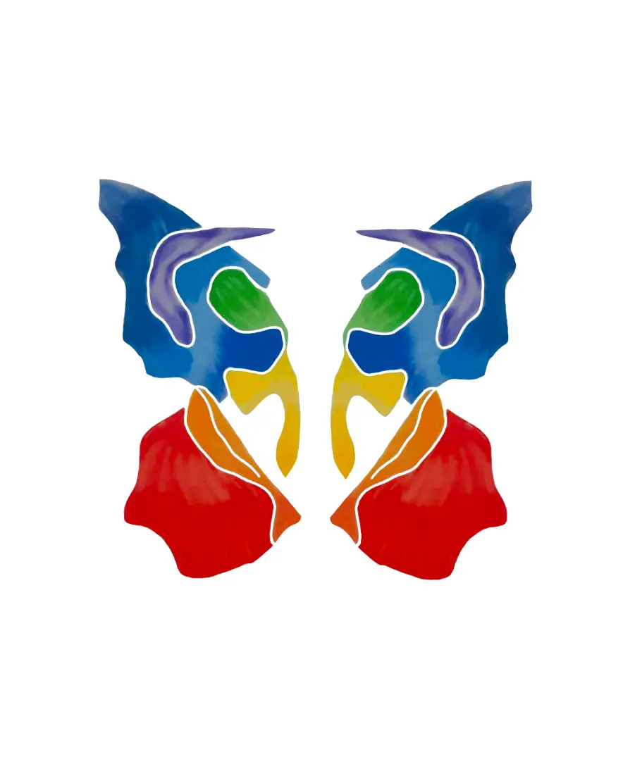
My inspiration for Flutter Bye Bye was for my connectivity between butterflies and how the meaning of colours can be the resemblance of any emotion. The painting is symbolism for transformation and hope as a caterpillar slowly transforms into a delicate winged creature and how a person can so every slowly transform into a new person to start a new chapter in their lives. I began by looking into Rorschach paintings for an idea of symmetrical art, this included by trying a 3D symmetrical effect of a butterfly, but the lines were too thick, and this was not my vision for my last final. So, I used a symmetrical ruler on my device and used a black pen to outline the figure of the butterfly and used the same technique as I did for my first final. Having the exact same colours, features, and shape on either side of this piece created a sense neutrality. Having the butterfly as a final reminds me of how no matter what you go through in life and can always strive to become a better you and live your life to your fullest to matter what obstacles you may face in the future.
Client: Zoo and friends is a small toy company located in Cherry Town, NSW. Cherry town is a rural town which farms cotton, the population of the town has 864 residences. Zoo and friends currently have 12 employees working within their company.
Most of their toys are manufactured within their company and sent to bigger businesses. Zoo and friends have hired Jasmine Huybens to design a new soft animal toy. The toy will come with a new label and advertisement promoting the new addition to the company’s collection.
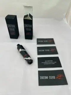
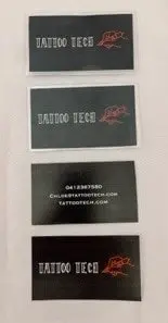
Client: Chloe Bright is a small business owner that opened her own store, named Tattoo Tech, purely for selling her personally designed tattoo pens. The shop's dark aesthetic enhances the pop of colour on each of the pens and accessories. i.e., gloves, packaging, power packs etc. Tattoo Tech is located in Maryborough Victoria and has employed Paige Melton to design a new, limited edition, tattoo pen, and its packaging, to attract new customers to her store.
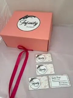
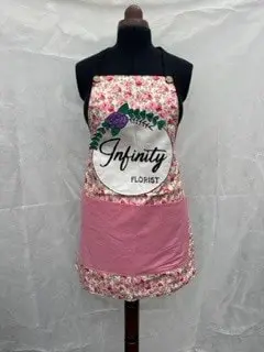
Client: Bella Lane is a young female that really loves flowers and garden, she loves having fresh flowers in her house every day. She believes they bring joy and relaxation when she is reading and looking at the flower, she just loves the way it brings the freshly picked smell to the whole room and into her mind. She also loves to experiment around with all kinds of flowers and she is almost addicted to finding various beautiful arrangements and as well as collecting vases with different shapes, different colours and different details. Her favourite hobby is to make every flower arrangement into a pleasing design by matching the colour and style of the flower to the vase or complementing the colour and style of the flower to the vase. Her dream is to open a florist where she can take care of all the different types of plants and maintain their beauty. As soon as she graduates from Art School, she will be opening a florist called “Infinity Florist”, which is going to be located on High Street at the centre of town in Maryborough as she was looking for a place in this area for a long time and she thought this area would help her audience find it easier.
Client: Emmy Loop is a young artist that enjoys creating her own nail designs for her friends and family. Emmy is opening a business after graduating from Art School. Emmy has been inspired to create her own business to extend her talent further in the forever expanding city that she lives in. Ever since the age of 8 years old, she has always been inspired by the stereotypical princesses and fairytale vision, especially the magic that exists around us every day. Including the magical and sparkle look to these nails expresses Emmy’s influences and styles. While her cities population is growing in numbers, she would like to eventually be able to post her nail sets all around the world.
My intention for Unit 3 and 4 of Media is to capture a series of at least 10 coloured photographs with the theme of shades and tones portraying emotion that an audience of people feel towards these represented colours. These photographs will capture a sense of the reality in a realistic manner to these objects, they will also highlight these objects as something more special and unique to other objects that are the same but with added stained lighting, it makes the subject (the object) unique compared to the same object but without the lighting. The emotions that I would like to portray with these pigmentations are all the stereotypical meanings behind the theory of colour for example, blues representing coldness and sadness, red representing anger and fury and purple representing fear and mystery. I can achieve this effect and these emotions from my audience by using bright lighting with cellophane over the top of it for each shade and then warm lighting for warm hues to make my audience feel a warm, comforting feeling when they are looking at a warm glow like yellow, and use cool lighting when I am capturing a cool hue like blue. I can also achieve this by using the same coloured objects to create even more of an effect on the audience as when there is more intensity, it will give a stronger mood and vibe of that particular tone and shade and/or subject.
The emotions that I would like to portray with these colours are all the stereotypical meanings behind colour for example, blues representing coldness and sadness, red representing anger and fury and purple representing fear and mystery. I can achieve this effect and these emotions from my audience by using bright lighting with cellophane over the top of it for each colour and then warm lighting for warm colours to make my audience feel a warm, comforting feeling when they are looking at a warm colour like yellow, and use cool lighting when I am capturing a cool colour like blue. I can also achieve this by using the same coloured objects to create even more of an effect on the audience as when there is more colour, it will give a stronger mood and vibe of that particular colour and/or subject.
I hope to make a product that makes the audience double think about the objects that lie around them every day and look at them with more beauty and colour even if it is something as dull as a paper weight. These photographs will show the audience just how easy it is to overlook things they may use every day and take it for granted. I hope to evoke different emotions and feelings towards these colours as they represent different emotions.
I chose this theme for my Media project for Unit 3 and 4 because it has come to my attention that people see different colours every single day but they do not realize what effect it makes it on the way they actually perceive objects and every-day items. I got this idea this by looking at every-day objects by seeing them all the time and wanting to highlight their uniqueness similar to how human beings are so reflecting it like the above will connect the audience to the photographs more than something that they cannot relate and connect too. I was inspired by Olivia Parker in the way she frames and crops most of her photographs with one main colour similar to the way I want to capture the shades and tones in objects/subjects.
I indented to create an about 18 page A4 matte personal lifestyle magazine with a pastel rainbow theme showing some stories of that main media tend to avoid, also known as Zine which are small stories with little publication, it will create audience interaction. I intend for this product to enlist a feeling of calmness, my magazine will be a informing for the people who are around the area of the Central Goldfields. It will consists of life stories of people who live in the Shire area, photography of sunsets, and animals, life, art, theatre. This magazine is for people who enjoy the lifestyle scene and will encourage them to show their life on their heart appreciating what is around them every day. Ultimately this magazine does not aspire to introduce new people to the Goldfields Shire but rather build support for them by creating further passion and interest among their existing supporters.
The audience is for people who are interested in reading about the quite lives of small towns. They are the type of people who like asking questions about how the "little people" are doing. They have an active interest in reading the newspapers, and are interested to lean active news of happenings in the town. It is likely that they are not particularly interested in mainstream media. They enjoy stories that are more individual, expressive and may not appeal to the makers of main media and a mass audience. They are not just interested in the stories but also the interviews, photography, puzzles and information like animals and history. When choosing a lifestyle magazine, they will have certain expectations. It must be fresh, detailed, and insightful and have a great deal of integrity. It will be moderately well written [Dunno yet]. They enjoy reading The audience will already have a good understanding of Maryborough and surrounding and its associated news and subcultures.
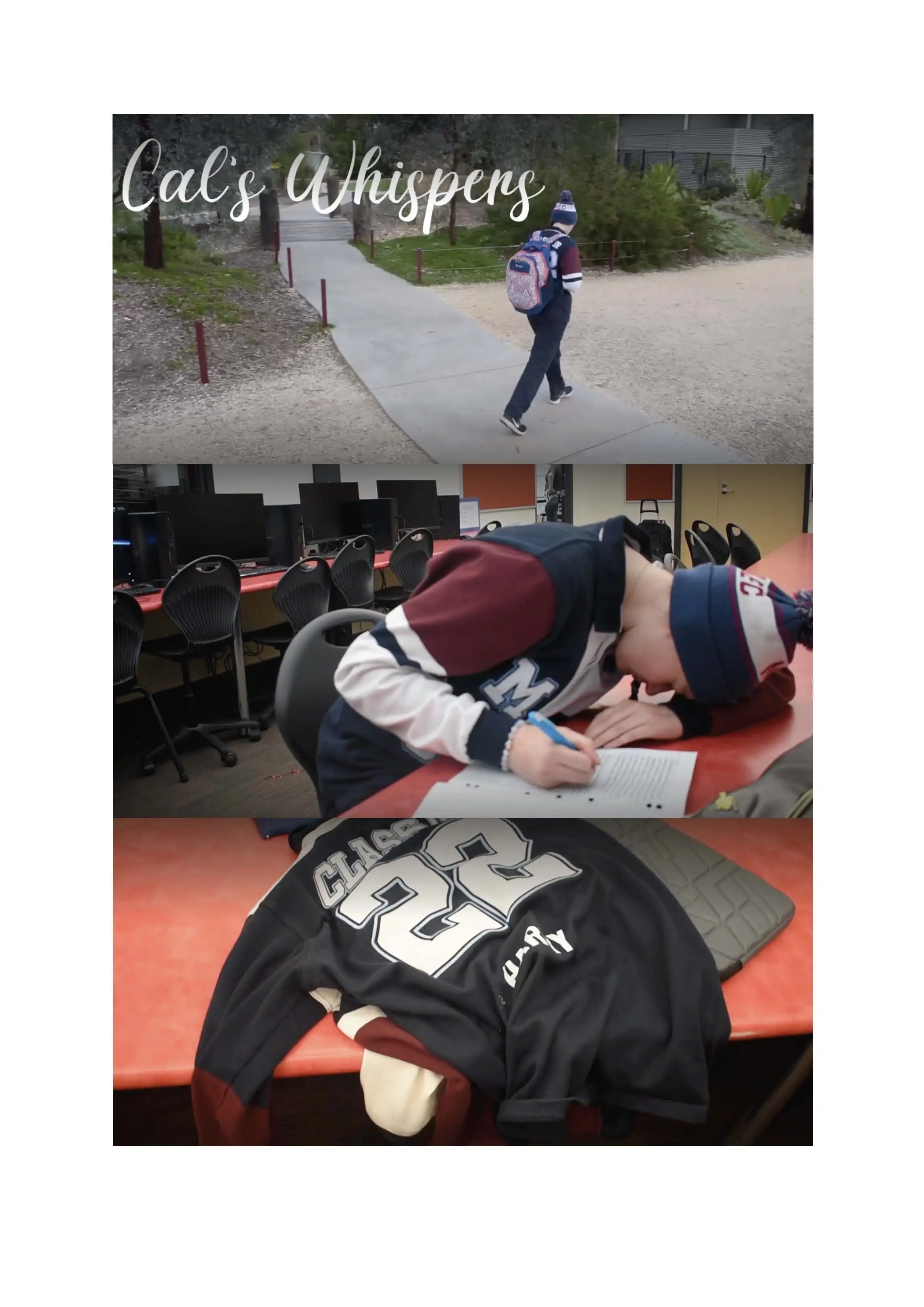
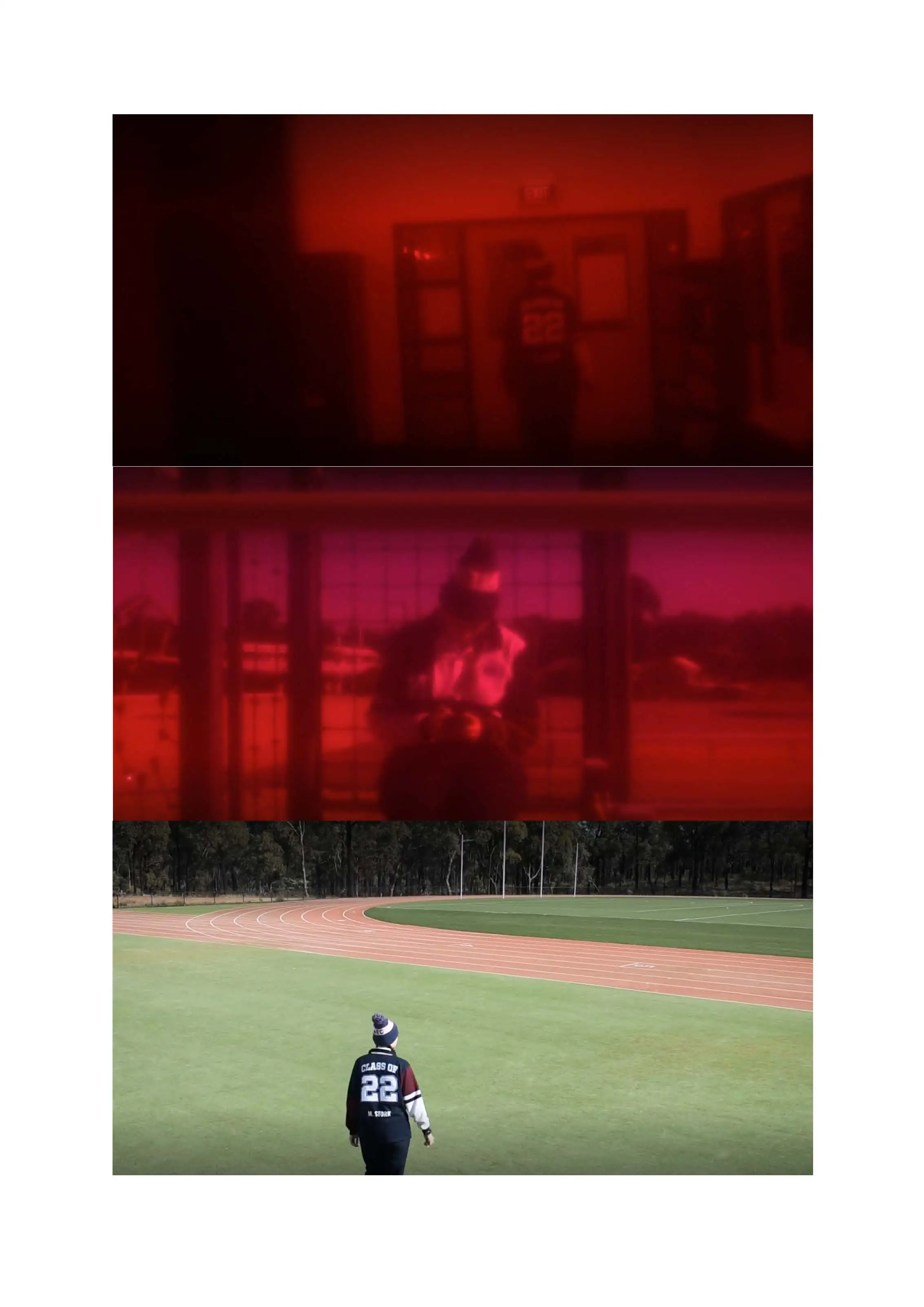
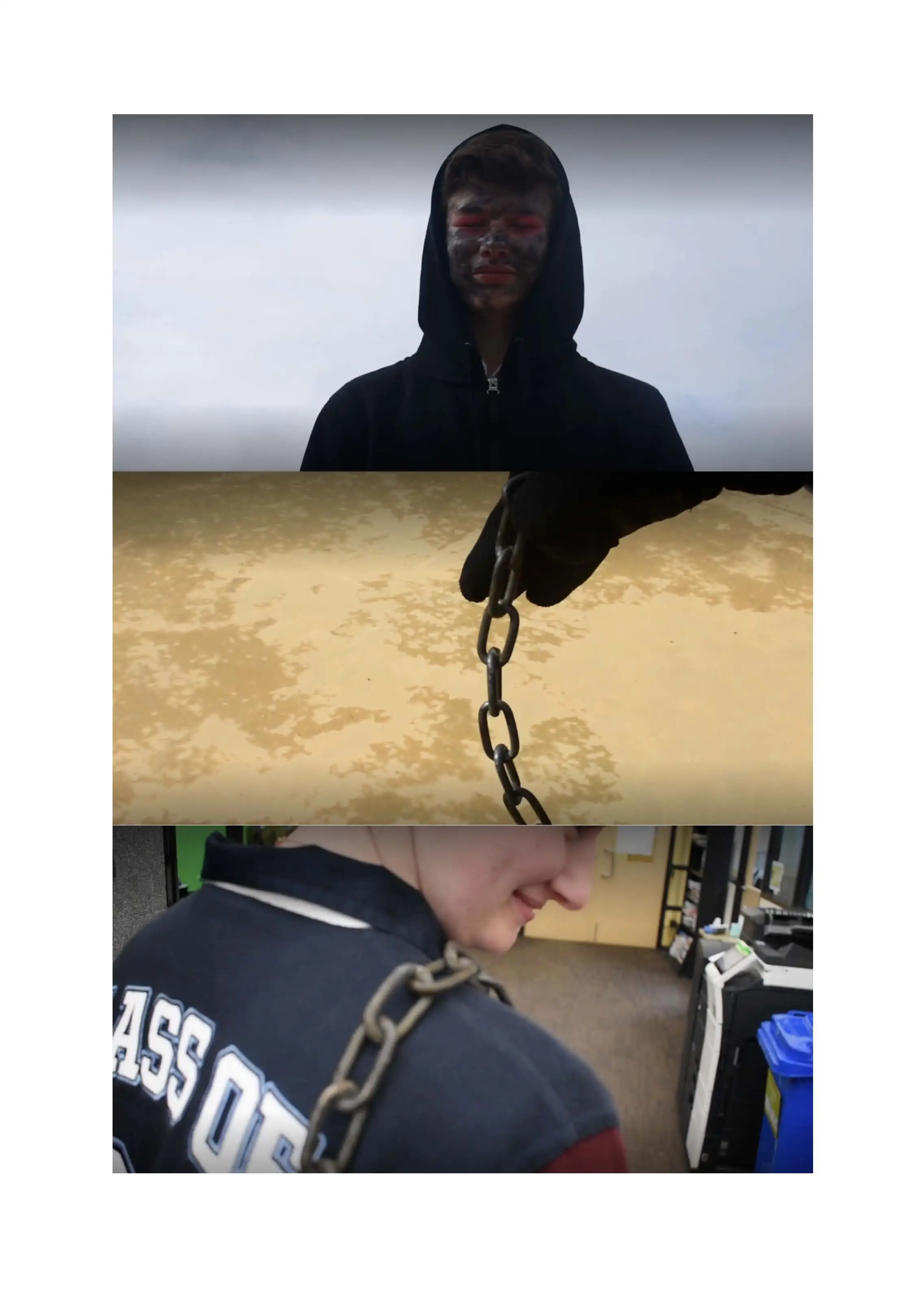
For my media project this year, I intend to create a short 3-5 minute media film with a maximum of 10 minutes, with this film I will be utilizing a variety of camera angles and new colour and lighting techniques to create a sinister effect. Through this film I aim to entertain and astonish the audience with a gripping story that will keep them on the edge of their seats and keep them guessing long until the credits roll. I will do this by leaving the story on a cliff hanger. This could also be a fake out ending. I will make the audience believe that the protagonist is safe and fine and then pull the rug out from under the audience and reveal that the ending wasn't so happy. I will explore the themes of loss, grief and fear to illicit those same feelings in the audience and try to replicate what the protagonist feels which creates a link to both the audience and protagonist, making the protagonist relatable. I will use some typical horror movie tropes such as the faceless stalker, long chase scenes and mystery, these tropes will be used to create an immediate sense of familiarity for the audience which will help them engage in the plot. The narrative will follow the protagonist who wakes up all alone in a world that was once full of people. A mysterious stalker follows her and wreaks havoc on her new life.
The film will be live action and linear with one flashback scene/ montage early on. It begins with flashes of memories, with bright lights and sharp sounds before it goes into the morning routine montage. Using the montage I intend to establish the protagonist as a normal character that the audience can relate too. I intend to create an connection between the relatable protagonist and the audience and this will make the audience empathise with them and elicit the same feelings that the protagonist is feeling but to the audience.
The film will include little to no dialogue and only one or two full conversations. This will be done to show realism in the situation as most people in this situation wouldn't constantly be talking to themselves. The antagonist will possibly have some dialogue. But this dialogue would be very sparse and in a harsh and croaky voice. There will be no overall narration and no hand holding throughout the film. A lot of the film will be left to the audience's own interpretation. The soundtrack will be eerie and quiet. The only upbeat music in the film will be Queen's song "Don't Stop Me Now" which will be used at the very start for a fun montage. The sounds will mostly be diegetic until the end where bird sounds and other more normal and calming sounds will be heard. This music will be used to drive the plot and put the audience in the characters shoes and make them relatable. Music and lack of music will be a big part of the film.
I intend to produce a 5-10 min thriller/horror film that explores being stalked through a series of unknown calls and messages. I hope to make a product that makes the audience feel suspense and eeriness. I aim to evoke certain emotion of fear and being on edge of the seat, through my use of CAMELS. I intend to do this through using different camera angles, cold lighting to make it feel eery and cold like and my use of acting and facial expressions.
I chose this theme because I haven't done a horror/thriller film and I wanted to challenge myself and see what I can do with last years knowledge of making a short film on my own and to see/show how my skills have advanced and progressed. I also chose this theme for the horror/thriller lovers (Myself included) and for it to be something different to what I did last year to be able to use different techniques of CAMELS
Particular acting and facial expressions in my film will range from being scared, terrified and neutral, this can be done by manipulating my facial expression range (Furrowed brows, wide eyes etc.) There will be a wide variety of body language consisting of being curious, open, closed off.
I was inspired by the eeriness of an unknown call, unknown random just having my phone number on a list of people to call. The show Pretty Little Liars also gave me inspiration on how I can use and evoke emotion, camera angles, suspense and tension in my film to create the following of a horror/thriller genre.
I intend to produce a 7 to 10 minute film depicting the effects of an entity stalking a pair of campers. My film will take the style of an emergency broadcast showing events of a fictitious entity attacking civilians, imitating the genre of analogue horror. It will be shot primarily in first person POV, using the convention of found footage. My film will heavily feature Mise en Scéne, lighting, and editing to create an unsettling feeling, and to shock the audience.
The genres I plan to follow are analogue horror and found footage. Taking inspiration from stylistic choices made in various sources such as the Blair Witch Project (directed and edited by Daniel Myrick, and Eduardo Sánchez) and the Mandela Catalogue (produced by Alex Kister) I plan to implement key features of the works into my film. I intend to take inspiration from the naturalistic feeling of found footage media, specifically the minimal equipment and first person perspective. These key staples of the found footage genre will allow me to create a feasibly realistic scenario that my film could exist in the real world. The major features of the analogue horror genre are reliance on sound design to induce fear, and the corruption of familiar environments and objects to provide an unsettling feeling. By utilizing these features, I will be able to provide a unique horror experience that doesn’t rely on cheap shock tactics and leave an impression on the audience. I intend to implement features of the ARG, or alternate reality game, genre into my film by including hidden codes and puzzles within the film. This will enhance audience engagement and provide a more in depth outlook on the narrative of the film.
A brief retelling of the plot is as follows; a young couple go camping in a local reserve where a being stalks and hunts them down. Throughout the beginning scenes occult imagery begins to appear in the bushland. The couple eventually get separated, with one exploring the bush and one seeking out someone able to call for help and report the occult imagery that was found in the bushland. The character exploring the bush has an encounter with the being which leads to them being killed, and the character seeking help is chased down by the being. Throughout the film emergency governmental public service announcements interrupt the plot, detailing information on the being and revealing strategies to counter its attacks and prevent it from spawning. These broadcasts will occur at the beginning of the film, in the middle section after the first death, and at the end after the other camper is killed. The final scenes before the broadcast will include a tense chase scene, with the being glitching through reality and giving a climax to the film.
Amity drew inspiration from her passion for the music that has been the soundtrack of her life. In her final works, Amity’s focus specifically on hopping musician David Bowie, as he is highly recognizable, and hopes to evoke feelings of nostalgia and fondness in viewers of her artwork. Hero Throughout the Years is a presented in a flip-book style and consists of multiple graphite drawings combined with mixed media. Hero Throughout the Years depicts the ageing, multi award-winning artist, conveying how time changes and manipulates his personality, his style and his physical features. The fluctuation of contrasting colours and differing media creates visual representations of the cultural context, emotions, and experiences of David Bowie during the time frame of each portrait. The years that are depicted are 1964, 1969, 1974, 1979, 1984, 1989 and 1994.
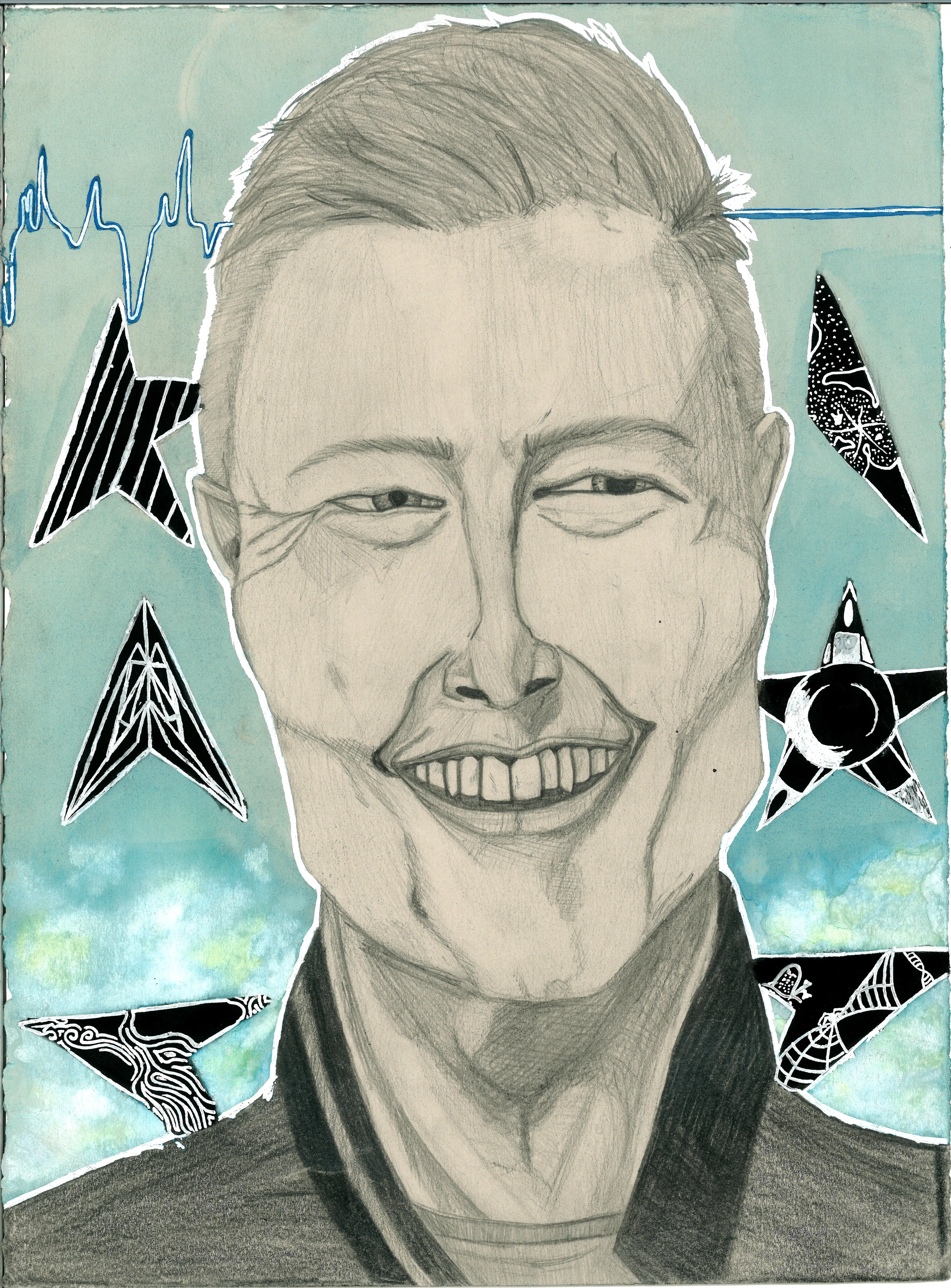
Final Dance in The Street is a single portrait that depicts David Bowie, before his death in 2016. The portrait depicts the flat line of his heart rate in a calming blue and white, a symbol of his peaceful death. Black star shapes in the background bring a sense of finality to the work as they pay homage to his final album ‘Blackstar’ that was released days before his death. The combinations of the cool tones of the background make it feel as though it is a lightly cloudy sky, radiating feelings of peace and happiness of a life well-lived.
The world of imagination is expansive and forever changing. What comes to your mind can become a reality; the only limit is your imagination. This drawing features a dragon species called a Tree Hopper, a dragon that hops along the trees out of sight. The artwork consists primarily of greens and browns, with some yellow accents. The abundance of leaves in the drawing makes us feel like we are in the trees with the Tree Hopper.
I love sculpting my characters, bringing them to life in 3D form. This ceramic work of the Tree Hopper is quite large and took many hours to be completed. The Tree Hopper consists of green glazes over his body and a brown tail with fluff at the end of his tail which is soft and wispy to the touch – acting like a feather duster. The glaze on the ceramic work makes the work shiny and helps make it waterproof.
Video: Showing a 360 degree view of Brylee Howlett's Tree Hopper, glazed ceramic sculpture.
Throughout history, society has found ways to entrap women into staying quiet and obedient. One of those ways being marriage. The two hands are chained to each other because they are joined together in matrimony not by choice but expectation and hierarchy that belittled women into conforming to societal expectations. The two silhouettes are moving away from their utopia to demonstrate the it was marriage that separated them from their own paradise. The chains are on the fingers to represent the statement ‘til death us do part’ as in only in death when the sacrament is broken will they be able to be free and ‘return’ to their own heaven. Which is also where the rainbow comes in as a rainbow is typically associated with heaven and them walking away shows that they cannot return to it until death part the two.
Clothing for women is often what defined one’s beauty and status. The costuming of this works is to coincide with the men. Each couple are complementary to each other or more precisely the women are complementary to the men. This work represents how for most of history a women’s purpose was to marry well and be an accessory to their husbands. It can also be noted that all the women’s costuming is very extravagant, bright and materialistic. It was an expectation for women to be the ornaments of society and act like a fragile gem. The women are also all faceless being hidden behind one of their extravagant accessories, this is to show that women weren’t actually considered their own person and therefore had no voice or even face, they were simply an extension of their husband.
This is a dry-point etching depicting Alligator Loki and frog Thor. Loki and Thor are preparing for a big battle. I am very interested in Viking and Norse mythology. I am a big fan of the TV series Loki, which gave me inspiration for this artwork.
I was attracted to dry-point etching because the aesthetic effects dry-point can have. I wanted the work to have a dark, mysterious and ancient feel. I used a black intaglio ink when printing, and watercolour to bring energy to the composition. It was a time-consuming process, but I was determined to never give up, just as Loki and Thor wouldn’t give up. They are known for their determination, no matter how hard the task is. Loki and Thor are two of the main gods in the Norse mythology and are known for their strength (Thor) and trickery (Loki).
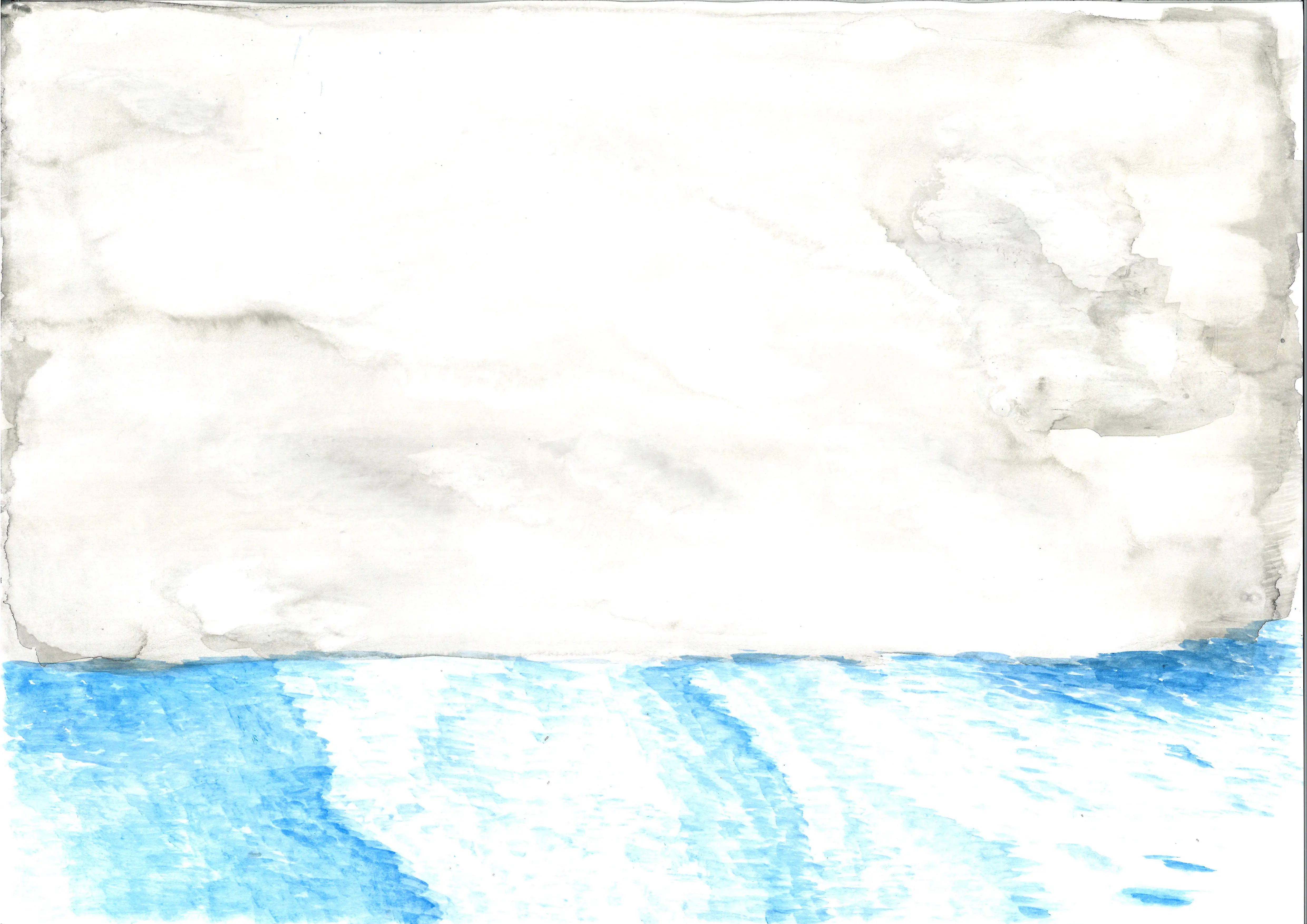
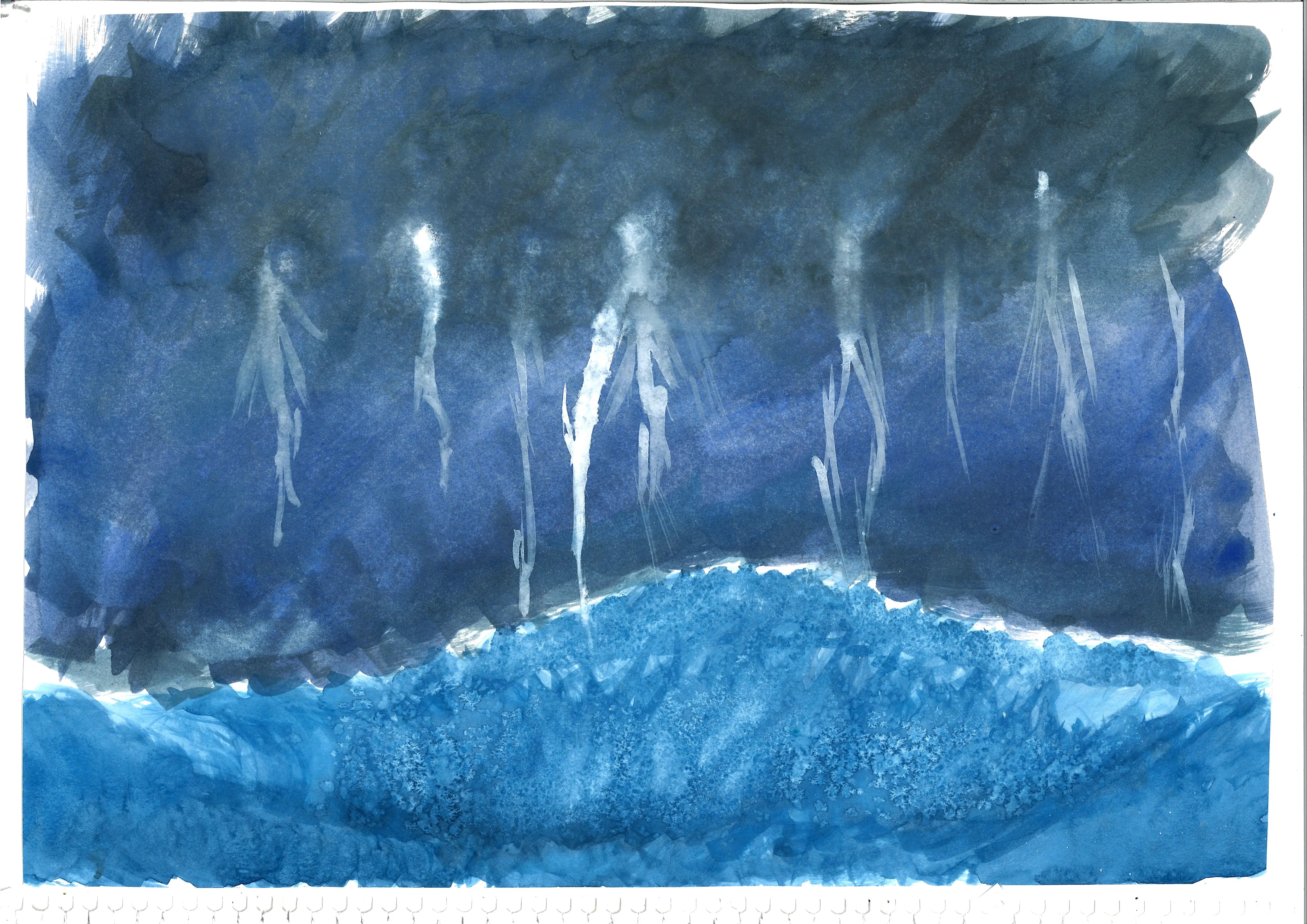
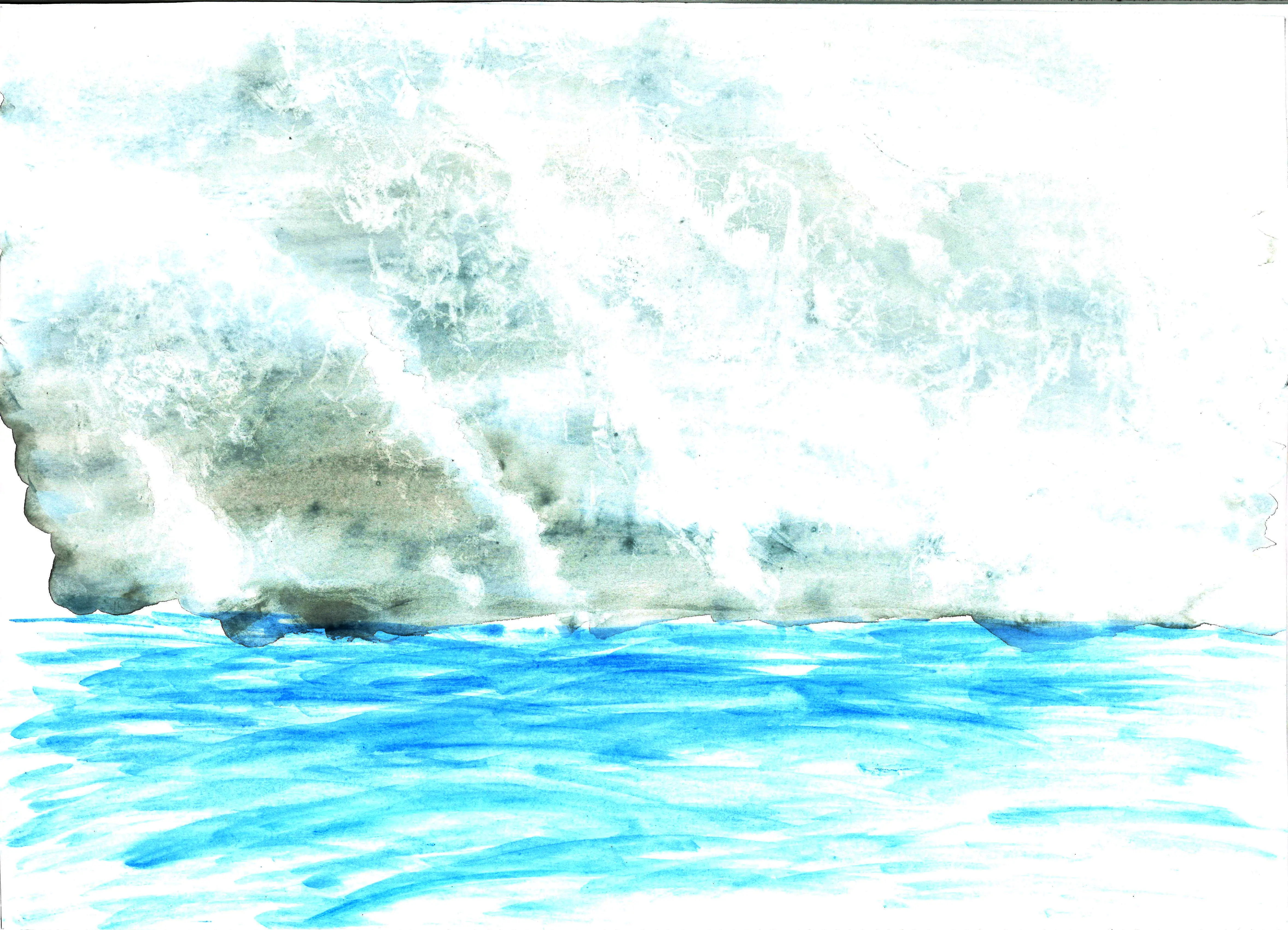
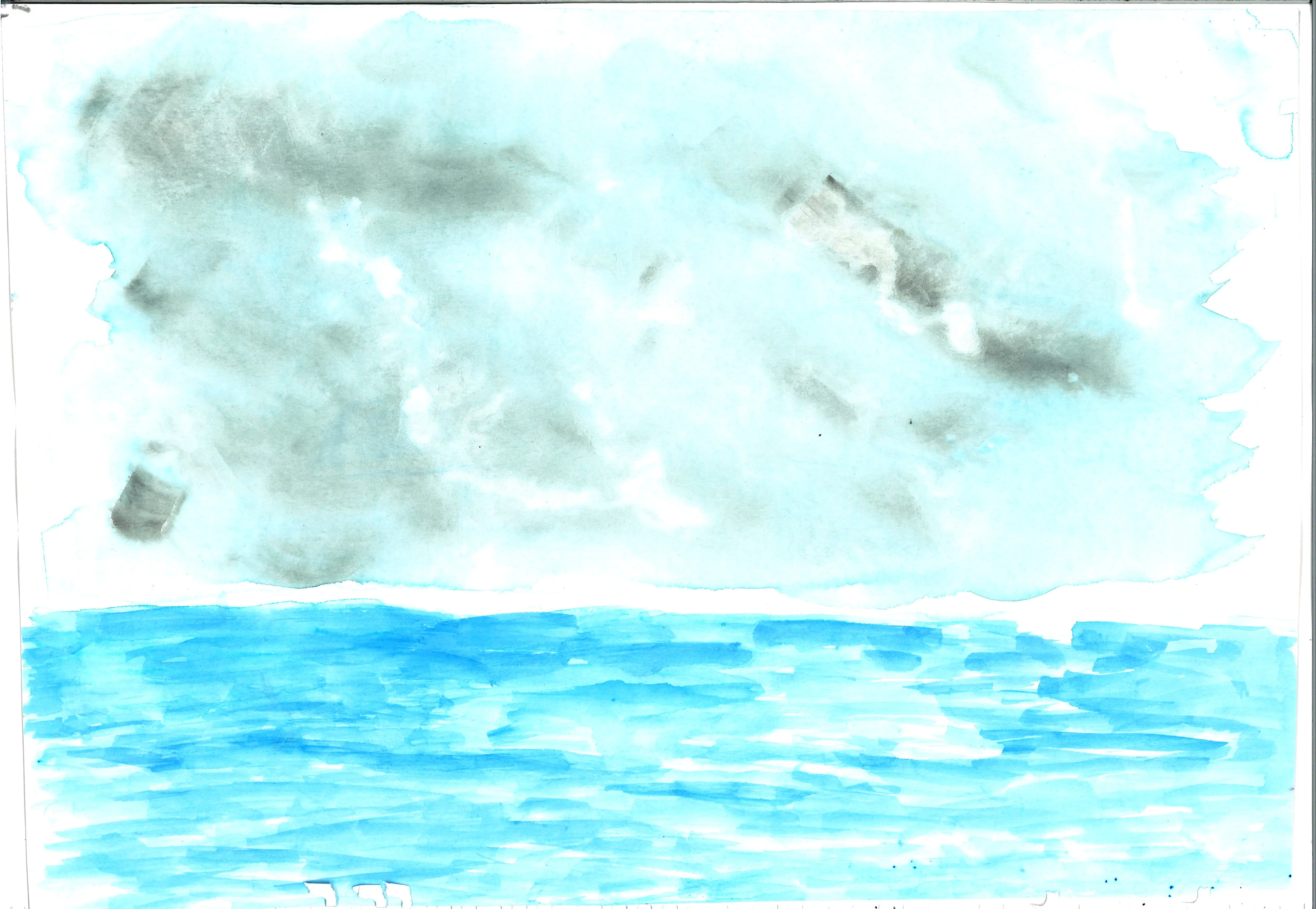
There is a special relationship between water and sky. The sky influences how the water appears to us. Energy from the sky, such as the sun’s rays, gentle breezes, ferocious winds and stormy clouds influence the way water behaves. In this series of watercolour paintings, I have tried to capture the aesthetic of all these variations.
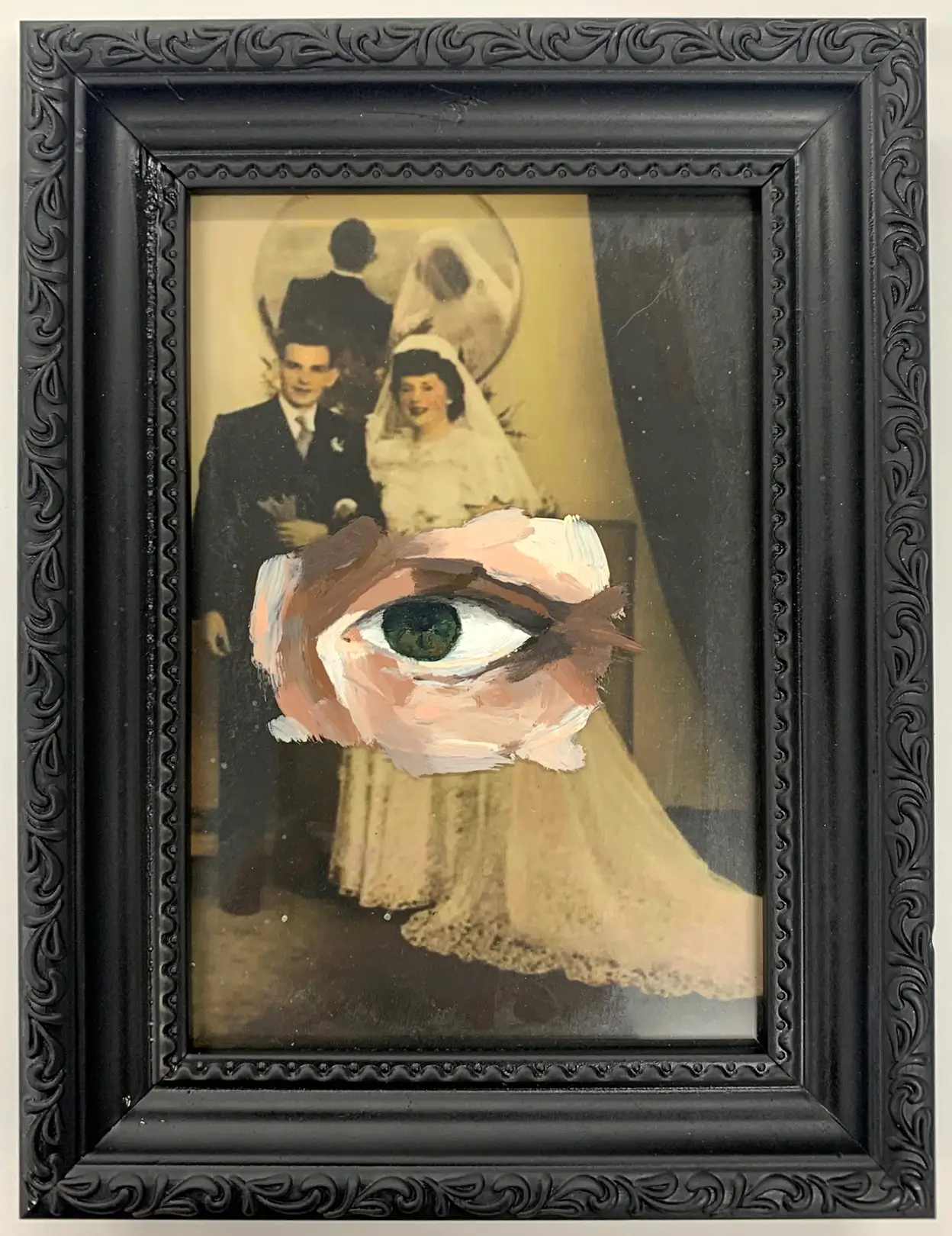
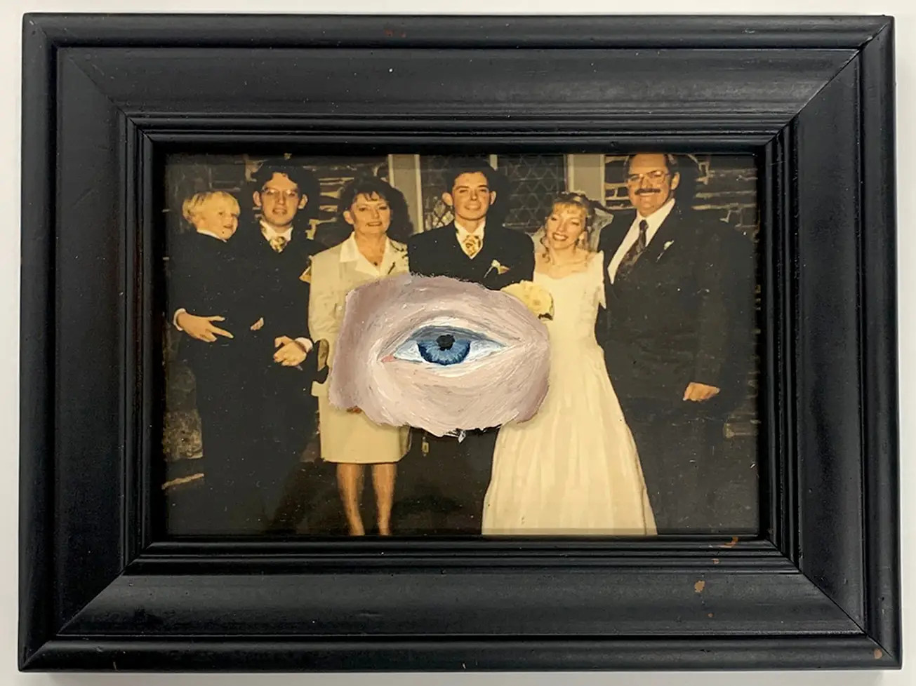
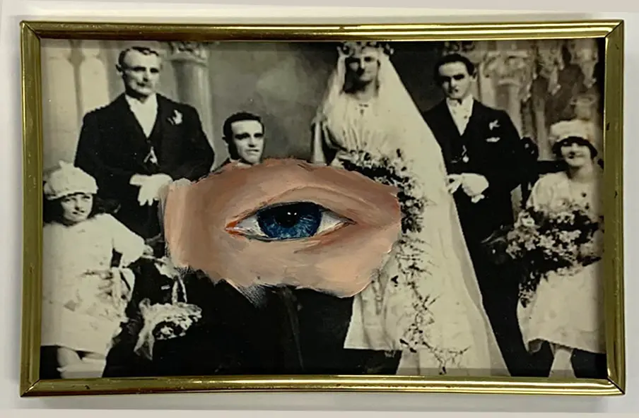
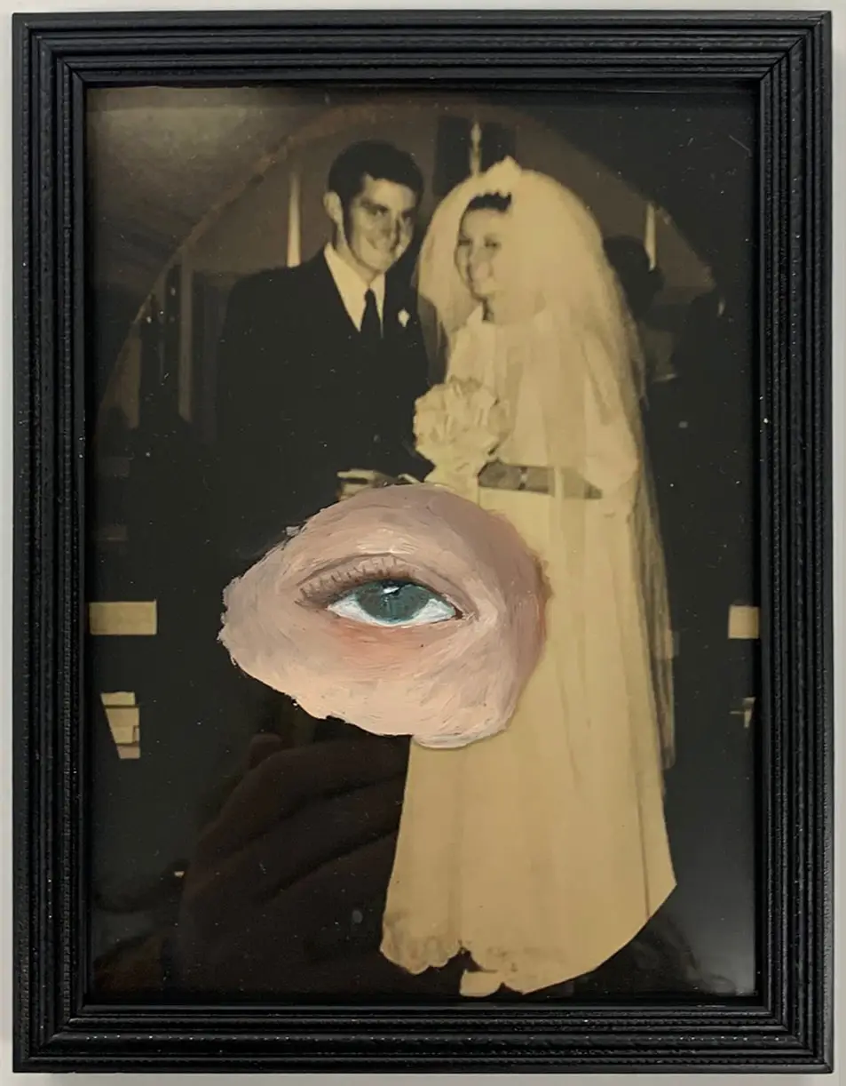
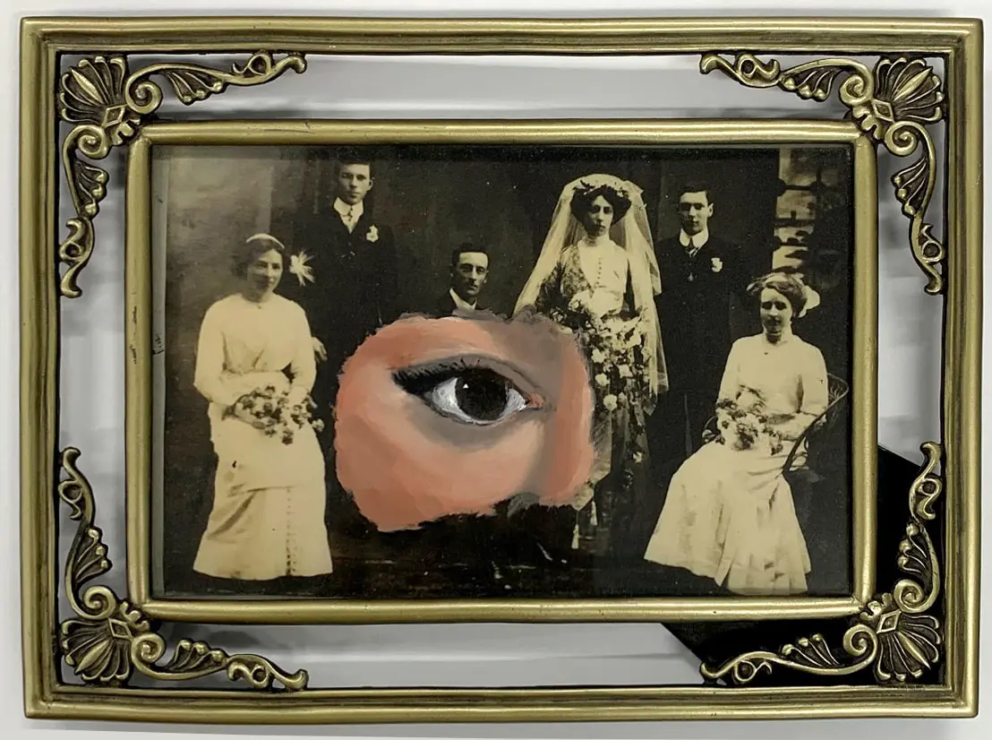
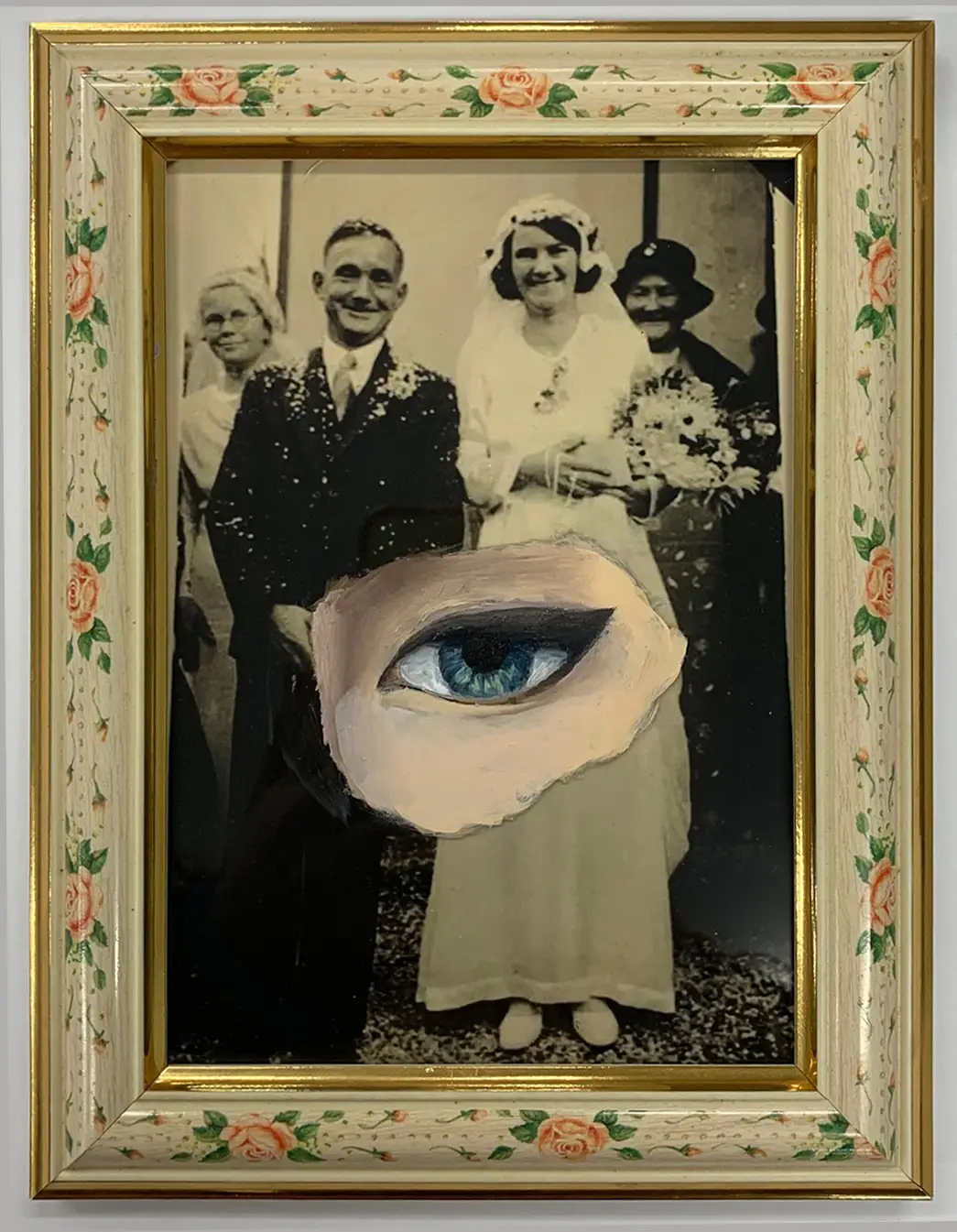
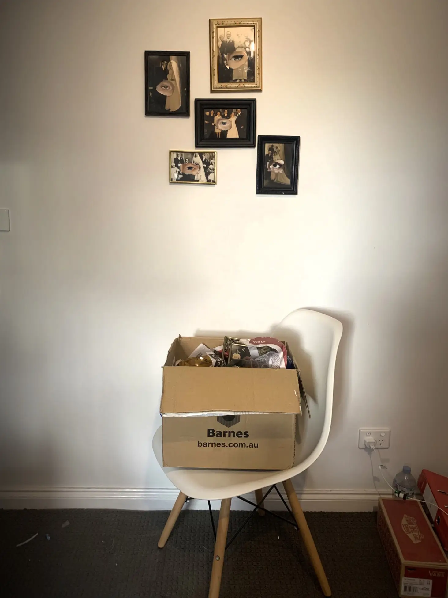
Family views explore the human need for family connection. The piece consists of oil paintings covering old family wedding portraits in vintage frames presented as an installation. The scene will appear to the viewer as an act of transition, either the unpacking or packing up of family photo frames. The work aims to create a sense of sentiment and familiarity with the viewer and a connection with the act of unpacking or packing away family memories as occurs with changes in life and the movement of time.
Family views explore societal constructs on keeping hold of the past while moving forwards with one's own life. Different painting styles of the eyes symbolise change through various degrees of abstraction and realism.
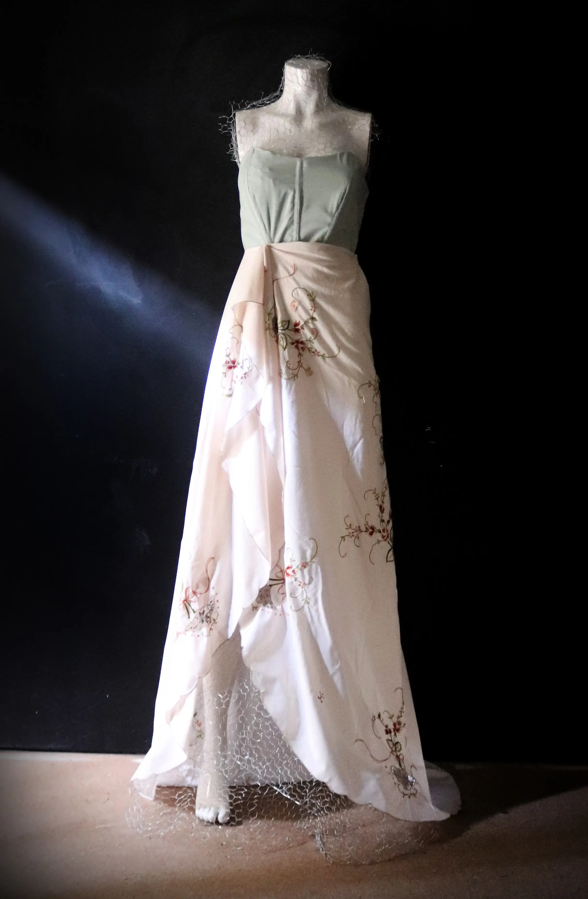
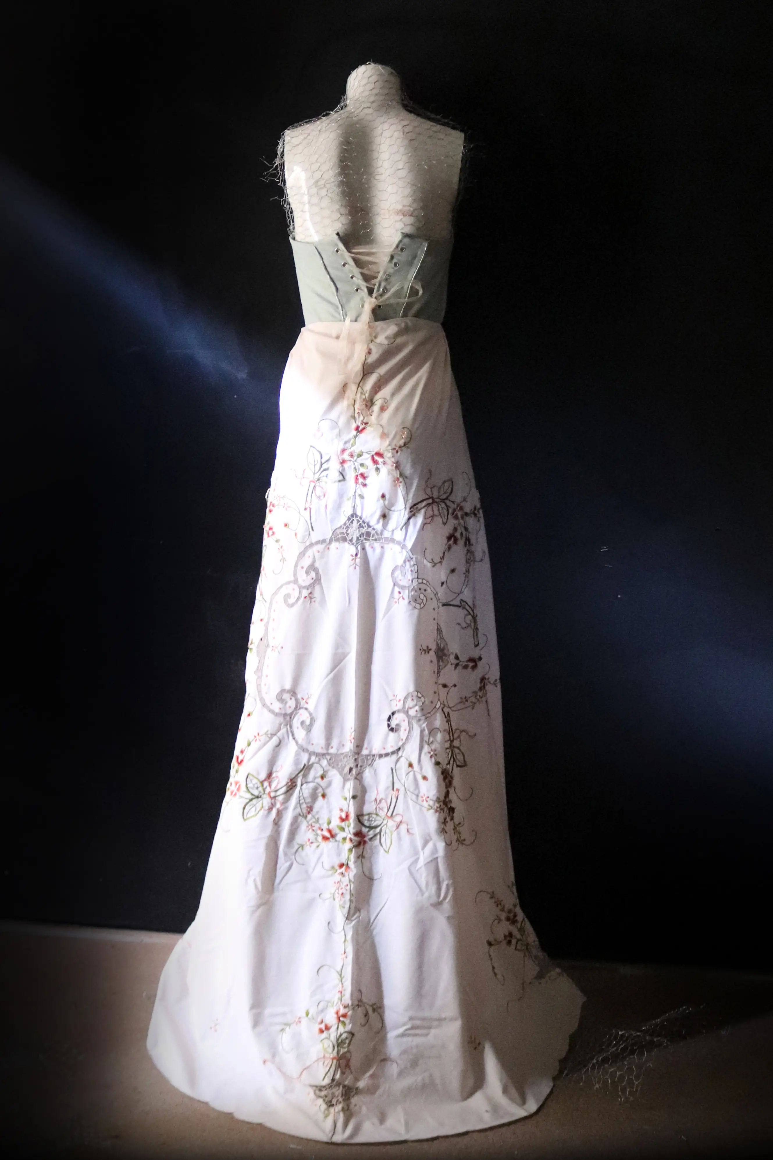
This garment seeks to embrace that sense of a previous life and faded memories through reclaimed textile use. It aims to celebrate beauty and reject fast fashion. It exists beyond any fashion genre. Its conception directly results from personal expression, a desire to find one's true self and not hide behind fake societal norms and trends. There is a need to react against the fast fashion industry's negative aspects, accept the change occurring slowly, and strive further towards how we can improve and reduce our carbon footprint.
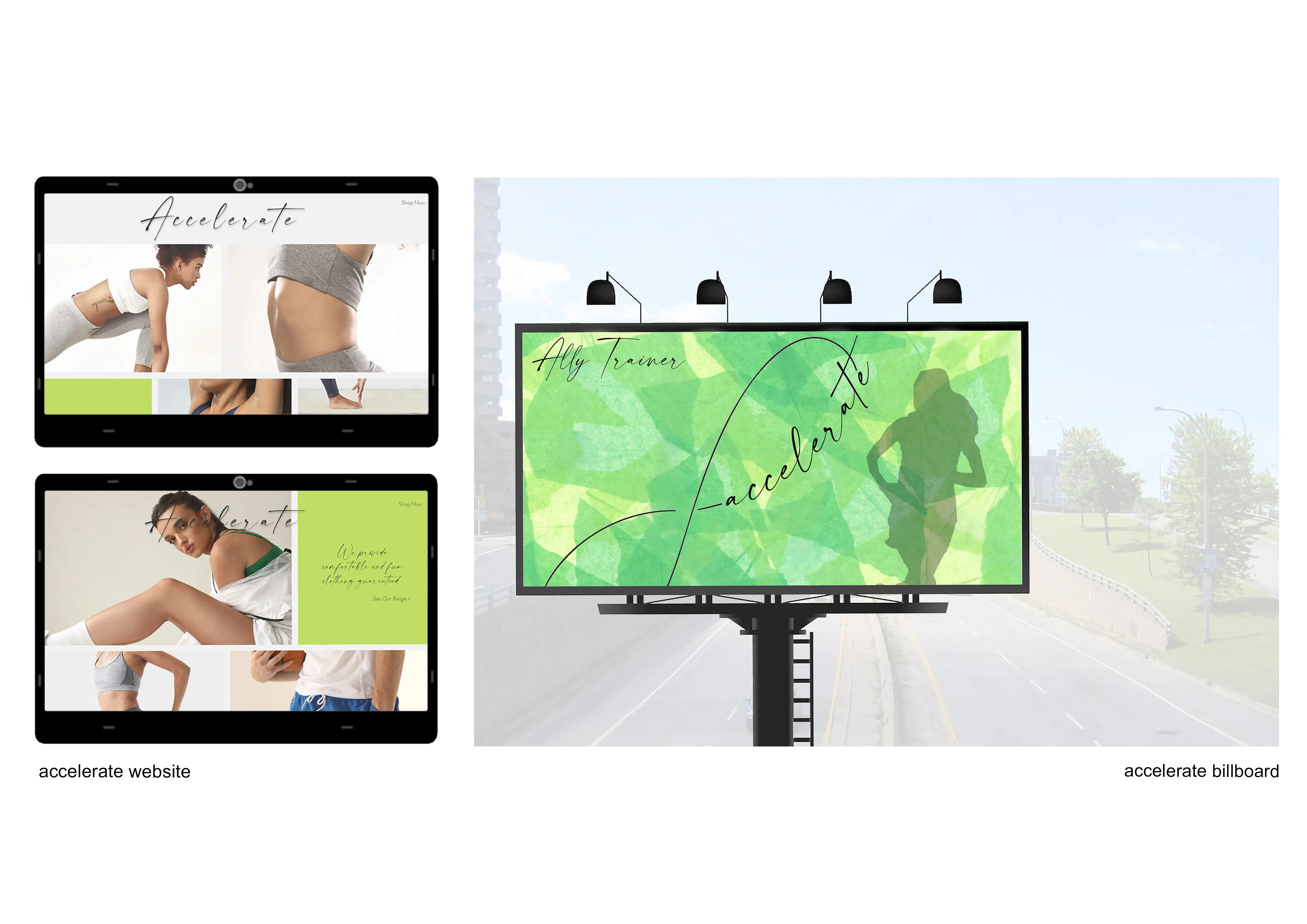
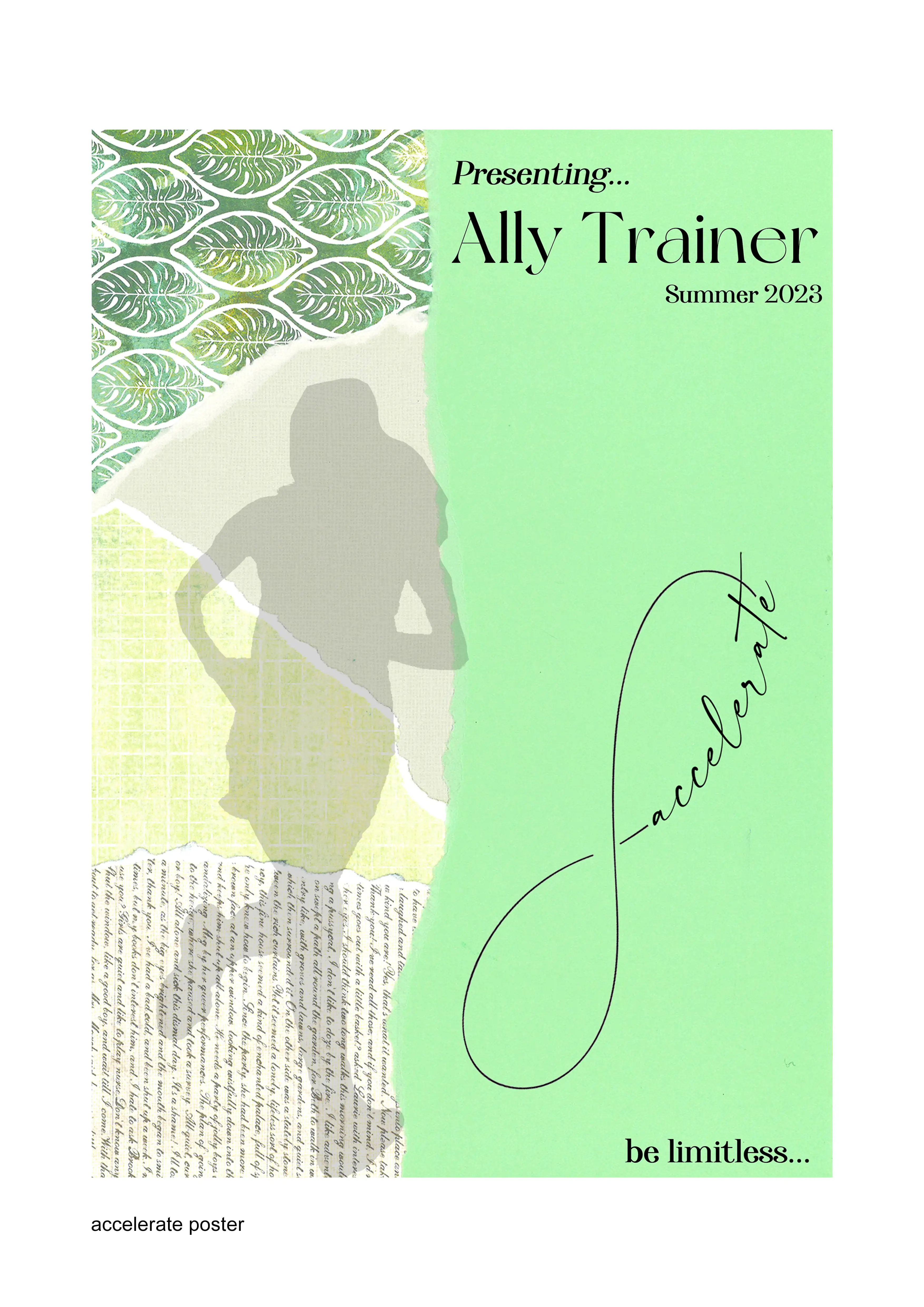
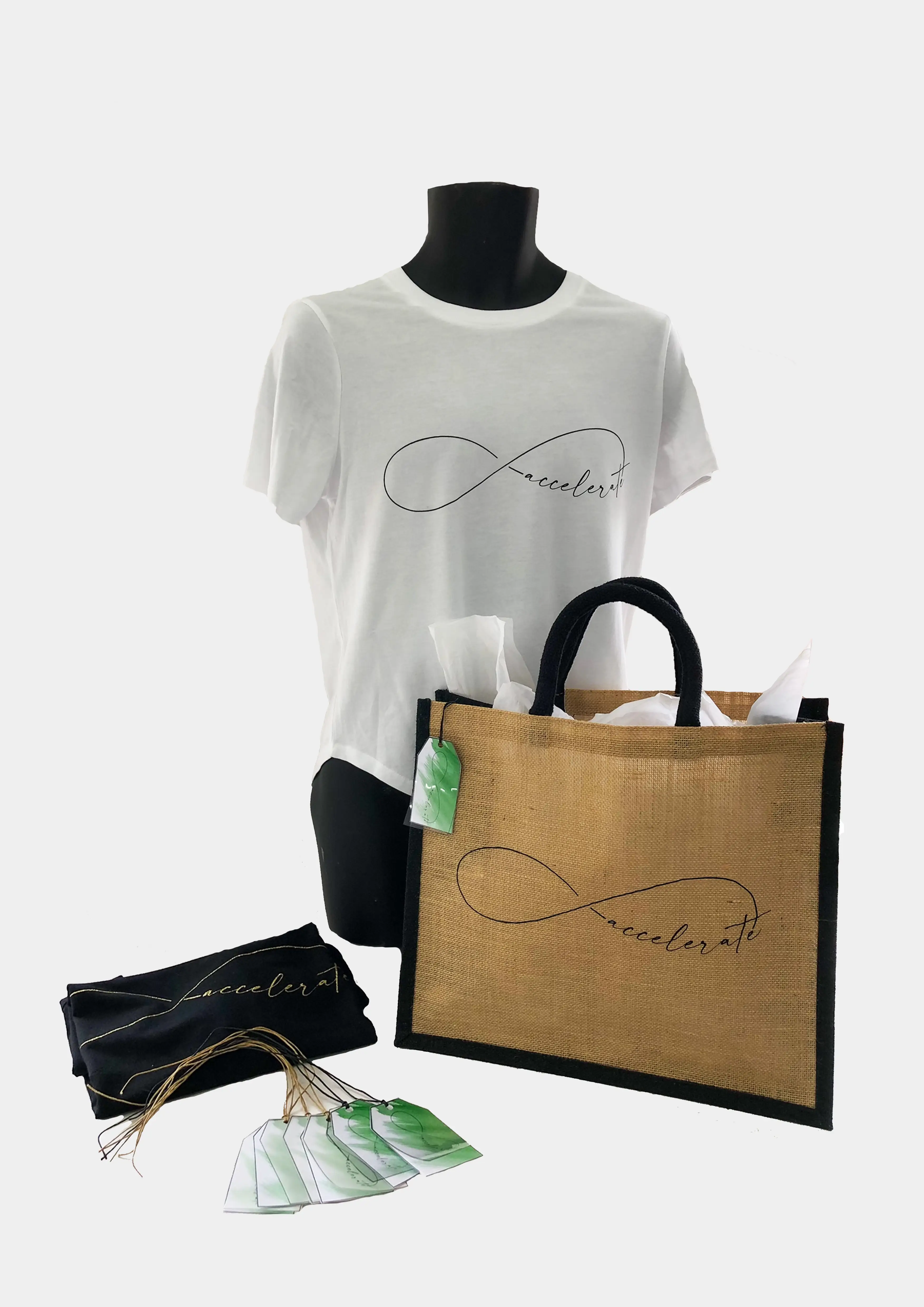
I created a wordmark using the brand name, ‘accelerate’ in etching, which was further developed in a digital-based method. I included the brand identity in the promotional poster, website surface graphics and billboard design for the company, ‘accelerate’. The promotional presentations were created to advertise the sportswear brand that Ally Trainer plans to launch in the Summer of 2023.
The silhouette of the runner within the promotional poster and billboard was a digitally manipulated photographic image of myself. I adjusted the proportion and scale of the image to enhance the dynamic yet refreshing aesthetic for two different presentation layouts. The warm green was the thematic colour I decided to use together with figure-ground and cropping to gain the audience's attention and maintain engagement. Research says that green is the colour people can look for more extended periods with minimum self-destruction.
The advertisement presentation was created using a photographic image of a rainforest, which was digitally manipulated from the original photos to promote the company that would spend a significant portion of its profit on saving the environment and extinct animals.
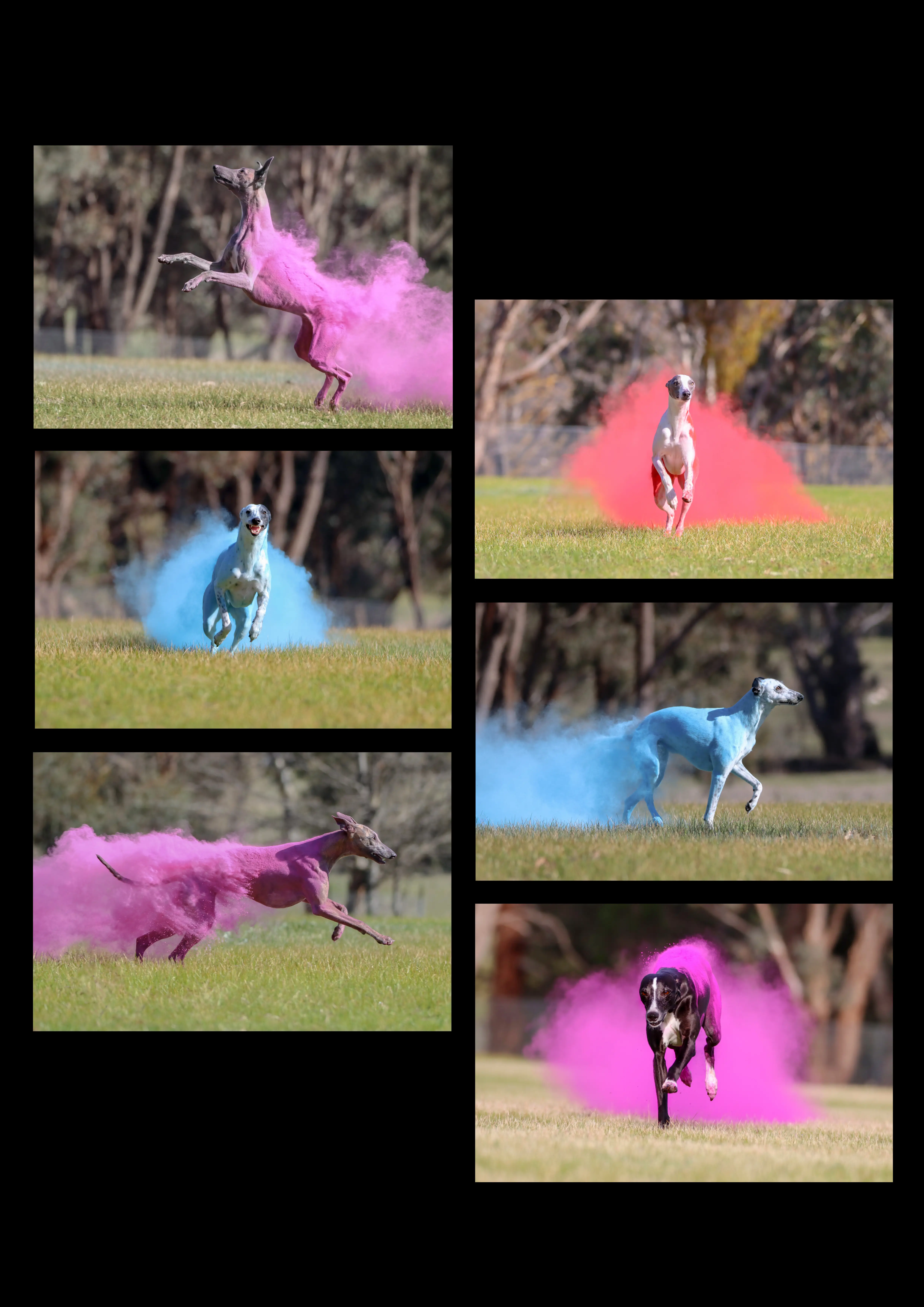
Colourful Strides explores the graceful movements of canines through a series of photos. Highlighted by the addition of Holi Powder, Amy Lamport explores the power of canine movement by incorporating coloured powder to add emphasis on their actions. Embracing a variety of colours whether it may be the powder, or the canine allowed Lamport to create a sense of individualism between each photo. Accentuating individualism provided the opportunity to convey multiple personalities within a singular collage.
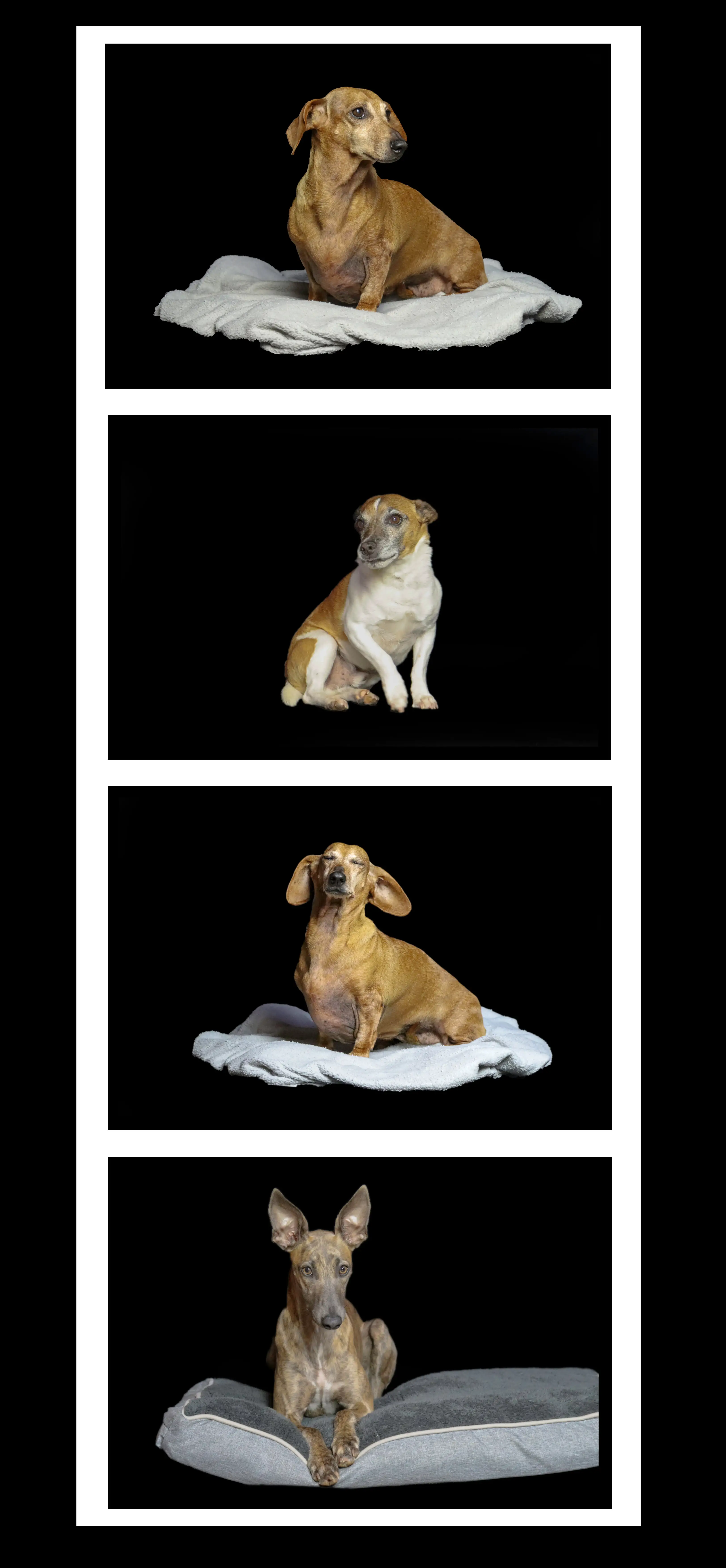
Through ordinary pets seen in an everyday setting encompassed by black background, Strike a pose contrasts the inclusion of Holi Powder. Amy Lamport evokes a sense of clarity and precision on the diverse differences between canines. Exploring the simplicity of individual canines allows Lamport to exhibit their varying personalities. Displaying these photos within a perpendicular collage provides the opportunity to convey the distinct differences within our pets.
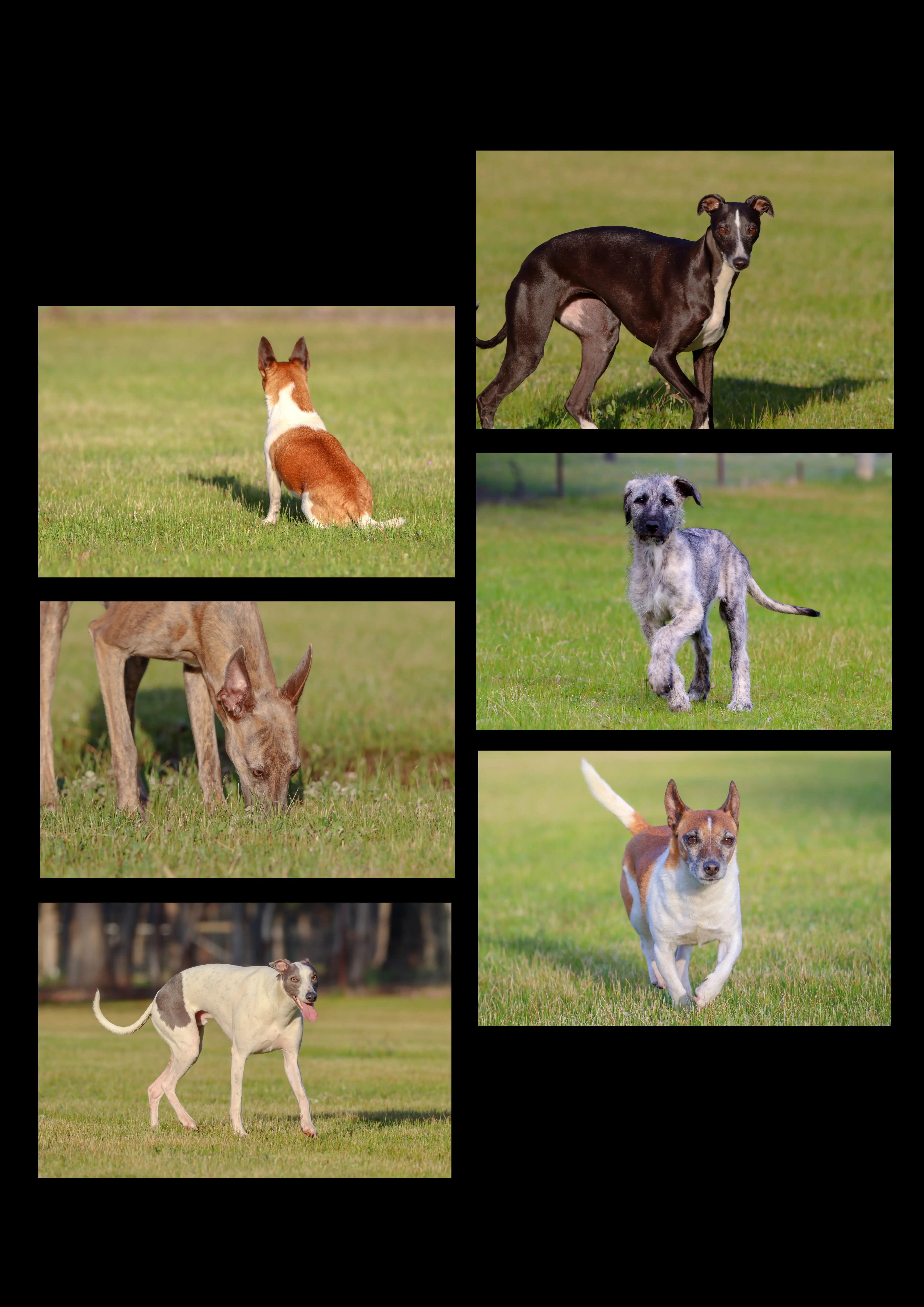
Naturalistic evokes a sense of balance between the collages. While retaining the individual personalities displayed through ‘Strike a Pose’ yet providing a contrast with the inclusion of a more natural background, Amy Lamport further elicits the individualism of each canine. Accentuating the simplicity of everyday actions examines how easily a canine’s personality is revealed through their behaviour. Flipping and utilizing the previous layout of ‘Colourful Strides’ warrants for the 3 collages to work in unison of one another.
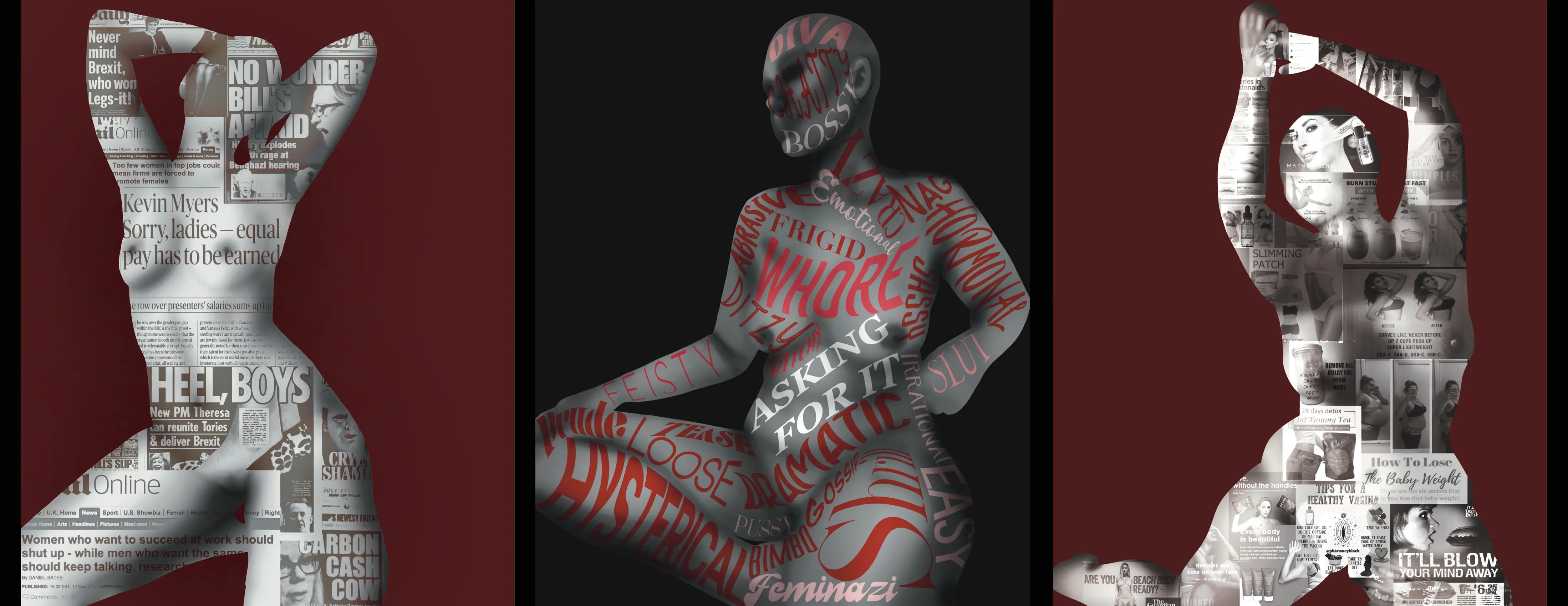
In this day and age, it is believed that all genders are equal. But that couldn’t further from the truth. With the rise of technology and media women are constantly being judged and subliminally taught how they should look and behave through comparison and shame. The two side women demonstrate how media shame women into conformity by degrading them or telling them how their bodies should look and saying they haven’t earnt their rights. the middle woman shows words commonly use towards women to silence them seeming tattooed to her body. This is to demonstrate that women are always dismissed and shamed by society for being themselves. All women are nude and proudly positioned to show that despite the oppression, women as a population stay fighting.
Ned has completed a scale model of his father’s John Deere Chamberlain Front-end Loader Backhoe. This project was completed within the Systems Engineering VCE Unit 3 & 4 course which required an integrated project with a mix between mechanical systems and electronic controlled systems. Careful and considered research was conducted for the choice of materials that the project was made from. Additionally, testing of different sub-systems were completed before the final design.
Ned has spent countless hours creating this functioning model which includes features such as:
Remote control to a distance of ~100m
Raising and lowering of front and back bucket
Speed reaching 0.18km/H
Weight 12kg
Phone: (+61 3) 5461 6600
Old Fire Station
1 Neill Street Maryborough, Victoria
Opening Hours
Thursday to Sunday 10am–4pm
The Gallery will be closed on ANZAC Day and Good Friday.
The Gallery will also be closed from 25 December 2025 and reopen at 10am on Friday 2 January 2026.